Prelude to the A-Frame and Day One the Divine Entrance.


May 28, 2023 11:59pm

Three blue sky days at the Ameliasburgh museum, setting up wet-collodion base camp, behind the stone Honey House, table and darkbox right and left of the honey bee landing strip and hive tunnel, fortunately this hive was no longer in use. Trepidation, a year and half of waiting, preparation, coordination the wetplate angst thick and full, fingers itching to get that first plate off and in the bath, so that angst needs replaced by clear mind and focus? Who knows? The nature of out-of-doors wetplate [as I have written many times before] is a game of dice even on the best of days, the chemistry warms at different rates and as an example the spring pollen can add its own decisions to the surface of the plate, hopefully not to aggressively and as the practioner, my way through to the end result is the subtle adjustments of exposure, manipulations of light and the development, plus and minus calculations that – the fates willing, bring me to the goal of a usable, dare I say, perfect image.

Alright now with the preamble out of the way, the residency photographic project currently called Silvered Tongued, started three days before I landed at the Purdy A-Frame, good thing too, I was able to get as much indecision and bad plates out of the way. But to our continued good fortune the illustrious Jean connected us with resident Ameliasburgh artists to share their home and splendid gracious hospitality, Shelia and Manuel – Vielen dank! Thank you for the nerdy geological discussions on glaciation and soil maps, the black double long espressos and the No Milk foamy cappuccinos. The project and good conversation are indistinguishable, I think to myself. The stories of family types these relationship squares/boxes of our lives and how time wears the sharp pointed corners off the edges, well, off some of the edges.  About historical lineages seven generations deep and how even those come to an end.  Fantastical stories of spectacular game show winnings, which the precise answers, came in the clarity of a dream the night before. Devouring legumes, chickpea flower and early garden shoots, Baco Noir and, ancestors forgive me  - Chardonnay, delicious despite my prejudice. All this wonderful humanity was bookended and peppered between with fondling of limestone Ordovician and Cretaceous jewels, picked and collected with intention and serendipity, hundreds of pebbles, stepped on by most. We could have just stayed, the stories and good company seemed endless.

Back to the Wetplateing, in Ameliasburgh Museum, sometimes affectionately referred to as Janice Land for she is the Curator and interpreter of the Village collections there. Janice opened the doors to the collections for us and gave us free reign, albeit with caution and museum handling credentials.  I had a year ago scouted certain objects that I could potentially find as muse or inspiration to the project and many of those became the directed focus and singular minded intention, the church spire the ‘Wilderness Gothic’ steeple from Al’s poem the obvious one. Others not so obvious, old honey tins stamped with producers names all residing in Wooler Ontario – the town being Al’s birthplace. Many people came by to chat or otherwise linger and have their portrait made sharing a story in exchange, it is really happening I thought - the project has begun. The cloudless blue Ameliasburgh sky made for hard contrast and quick exposures, with occasional corrections and chemical adjustments. The third days cleanup went slow, nakkered [exhausted], but knowing our home for the next month was literally just across the lake - as the heron flies.


Walking up to the A-Frame allows you to step back approximately 30 or 50 years, much of the trees and simplicity remain, although the surrounding palatial estates and meticulous green lawns have replaced the former cottages and  ALL the space between - the Charm and power of the place – this place – their place – the place of so many words and years of dedication, still fill the air.  I am snapped from my sentimentality as carrying of things and general moving in need my full attention, Heather points and gives me some necessary direction. After all the what-nots have mostly been placed, the ceremonial beer, “all beautiful yellow flowers” has been poured and drank, we survey the shoreline still intact and full of willows, cedars and spruce. Sadly the giant ash trees have been devoured by the insatiable ash borer and stand as skeletal shadows. We raise our glasses, Heather and I to the past, the giant setting orb, this present, the Purdy’s, the Glorious A-Frame and this beautiful residency.

The climatic moments ended, the necessity of sleep upon us. Wordless we brush our teeth under red painted boards reclaimed by Al from some other building – I walk down the hall and to the Purdy’s bedroom I peruse night reading from the bookshelf lining the entire forward wall at the end of the bed. A fetishistic collection of vintage pelican blues, interspersed with penguin orange stand out, I move right to the very end and find what I am believing is a book neglected somewhat, relegated to general or ‘collected’ section of the bookshelf, within the table of contents, singular poems circled in red – Al’s favorite Canadian poems? Or just ones that deserved the merit of the red ball point annotations – the exception[Als] I read two before I flounder and nod repeatedly, lights out. More on this later perhaps…


The Making of Hezekiah Procter - Collaboration with Li'l Andy

A man walks into the oldest bar in Canada - The New Westminster Hotel in Dawson City, Yukon - affectionately called The Pit. The band deep into their first set, a tall handsome fella, white cowboy hat tipped back croons a silky ballad amidst the common din of glasses tinkling and rowdy bar chit-chat, walking past the bar’s portrait gallery and bawdy paintings of royalty and RCMP officer, In flagrante delicti, past the stage I politely nod to the cowboy crooner.

That is how this collaboration started, honestly.

At the break I approached the stage and stuck out my hand and said something like, “ your music was perfectly suited for this exact place, by the way - have we met before, you look very familiar?”

*Side note: This is NOT the cheesy beginning to a steamy gay romance novel - although it may sound that way, sometimes life is just uncommonly common and yet, strange and weirdly beautiful at the same time, filled with strange coincidences - this was one of those days.

Back to our story, so after the hi, I’m Andy, I’m Paul schtick, we wind through lists of names that deliver us to the money, the source of our connection. We land on the link -a mutual friend that had mentioned each other in separate conversations, the talented Brian Sanderson [Esmerine, Sheesham & Lotus &Son…] And suddenly I was “THAT GUY THAT DOES TINTYPES” and as we spiral through the degrees of separation weirdness, it is discovered that I actually live, not far from where Andy grew up - emails are exchanged, my girlfriend and I, listen to most of the last set and then spill out into the midnight sun of Dawson.

Sometime later several project planning emails and a few Tintype experiments later, we begin to figure it out. Andy emails me several images of the musicians from the time period he is fictionalizing in and one image in particular sticks with me. It was a studio photo circa 1928 of Ernest V. “Pops” Stoneman And The Blue Ridge Corn Shuckers. The part of the image I loved the most was how the backdrop was undersized for the size of the group in-front and how you could see beyond “the fiction” to the reality of the studio/room they were in. This was not uncommon for the day, but most often the “overshot” would be cropped out in the final image.

THIS was what I HAD to do. I called Andy.

Ernest V. Stoneman And The Blue Ridge Corn Shuckers

Taken in Galax, Virginia, in 1928. From left to right: Iver Edwards, George Stoneman, Eck Dunford, Ernest Stoneman, Hattie Stoneman, and Balen Frost.

I began by nerding over how in the Stoneman image it is a duality of fictions, not intentionally, but none the less, and I was amused by the idea of creating a painting - an outdoor “studio backdrop” and placing it outside and purposely seeing and photographing beyond it, and that being the place where our re-re-re-creation will take place - making it, as the kids say…Meta. Andy loved the idea and the album cover idea was born.

Now I was painting a backdrop AND making the wetplate images, which was totally fine, I always wanted to try painting a backdrop, now I have a project and a concept and most importantly a deadline. Andy’s novella of the Story of Hezekiah Procter became the inspiration and I began sketching. Not to give to much away - (cause you gotta buy the album now, right?!) But, in the novel there is a strike and some drama and a factory burns to the ground. The symbol of a burning building is loaded with metaphor, I LOVE metaphor - so it became the prime visual element and the perfect focal point to the image. During my research phase, I sent a random email to Stephen Berkman, the master of the 19th century sideburn AND of the modern wetplate backdrop. He so very graciously offered his time and we had a two hour conversation about, layout, composition and most importantly colour. Even though wetplate is essentially a colour blind emulsion - he had some interesting insights that I tested to be true. More on that some other time.

Materials were bought, canvas was sewn, 14 feet x 10 feet, a bunch of old lumber was pressed into service and I raised the sheet after priming, like a giant banner to my naivety in the whole process. Whatever…apply scaling & painting skills and get to it - one week till first day of shooting…hope there is no weather - Paul says somewhat optimistically out-loud - don’t tempt the fates…sometimes I never learn.

I won’t make the story any longer - you can just watch the time-lapse play by play, and see one week in ten minutes - spoiler alert, there was weather.

It is important to state that the character of Hezekiah Procter and his accompanying historical fiction is the genius of Li’l Andy, I merely gave Hezekiah Procter a place to be famous in. The music, the story, postcards - the whole Box Set can be purchased at the link below - all wetplate or backdrop questions…send me an email.

Peace.

Maxwell's "First" Colour Photograph...? - Part Two

Part Two: Recreating the Experiment & the Results


It is probably best to begin with the details of the experiment that we do know based on how Sutton described them in No. 125 of the Photographic Notes, June 15th, 1861.


1st. A plate-glass bath, containing the ammoniacal sulphate of copper which chemists use for the bottles in their windows, was placed immediately in front of the lens. With an exposure of six seconds a perfect negative was obtained. This exposure was about double that required when the coloured solution was removed.


2nd. A similar bath was used, containing a green solution of chloride of copper. With an exposure of twelve minutes not the slightest trace of a negative was obtained, although the image was clearly visible on the ground glass. It was therefore found advisable to dilute the solution considerably and by doing this, and making the green tinge of the water very much paler, a tolerable negative was obtained in twelve minutes.


3rd.  A sheet of lemon-coloured glass was next placed in front of the lens, and a good negative was obtained with an exposure of two minutes. [This glass plate has been lost.]


4th. A plate-glass bath, similar to the others and containing a strong solution of sulphocyanide of iron was next used and a good negative was obtained with an exposure of eight minutes.

…The thickness of fluid through which the light had to pass was about three quarters of an inch…the negatives…were printed by the Tannin process upon glass and exhibited as transparencies… (Image 9)


When I first read this, the statement of 12 minutes of exposure for the green filter immediately raised doubts.  As stated earlier, fifteen minutes is pretty much the longest exposure one could achieve in the heat of a spring day out of doors. Taking into consideration all the handling prior and after exposure, if the plate had not completely dried out, a good portion of it would have begun to dry inward from the edges but yet, the plate exists? Again, as you read, the difference in exposure times between that of the blue plate at six seconds and every other exposure is measured in minutes, with the extreme example of green, an exposure of 120 times that of blue.


It wasn’t until I was able to take a magnified look at the original transparencies from the Cavendish Laboratories, that numerous wet-collodion details became very apparent, including the oddest detail pertaining to the VIVEX Tartan Ribbon photograph.


We can take an example of a true tri-colour separation of the period for reference. I use the Leon Vidal flower arrangement circa 1877 to demonstrate that when comparing the red, blue, and green channels, portions of the image completely disappear.  I understand that this is by no means fair comparison due to the advances of technologies, but it does illustrate what should, to some degree, be happening in the Sutton ribbon images. (Images 10, 11, 12)


If we do the same with Sutton’s transparencies this is barely noticeable, but what we can clearly see is that they become darker or lighter globally as opposed to specifically. In fact, in the blue transparency there are highlights from the change in sunlight creating noticeable increased exposure or “hotspots” (not because of colour filtration) which are still noticeable in the red slide although considerably lighter. If Sutton had managed to isolate colour these would not be apparent.  


We can almost definitively say that the repeated “overexposed” lines of the ribbon, which are repeated in each of the transparencies, are either blue or white because this is exactly how a very saturated ultramarine type blue or white presents itself.  “Haloing” is very common and consistent with wet-collodion. (Images 13, 14, 15)


So on to our experiment. We decided that it would be crucial to create a colour space that is known and repeatable.  Therefore we choose several currently available printers inks and then began to carefully measure their chromatic response.  This step is crucially important to a clear scientific understanding of how or if, they fluoresce, how much or little UV reflectance they might have, and where on the visible light spectrum they lie. 


By using printer’s inks we could achieve dense vibrant colours that use high quality pigment in high concentrations to give clear and factual signal response, clearly demonstrable in the resulting wet-collodion image. The resulting images were startling and might give some idea of what the image Maxwell project might have actually looked like. 


Another very important detail to remember is that projected light is very different from reflected light – that is, light passes through the plate and can dilute and disperse what we see as the emitted result whereas, in a print, what we see is the light reflecting off of the print and we perceive it directly. Compound the diluted transmitted light with the understanding that lanternslide technology of the time was very crude and would have used condensers and reflectors to concentrate candle light, these multiple factors could have contributed to lacklustre results.


Now to the experiment results:


During three exceedingly hot days in August 14th to 16th 2021 I conducted two experiments using wet-collodion photography utilizing two separated Kodak Wrattan filter packs. The first would be a standard tri-colour pack Red, Blue, Green which then modified and substituted greatly diminished filters of red and green just as Sutton himself had, after realising the initial densities of his red and green would not function in capturing an image.  (Image 19) Which became Blue No.47B, Green CCG0.20 and Red CCR0.20. Then on day three - Kodak Wrattan Neutral Density Filters ND0.10, ND0.60, ND1.60 all of course adjusted for required correct exposure. (Image 19a)


If we take a close look at the first colour separation results - knowing what the actual and precise colours were in our still-life arrangement we can see that very little actual colour separation was achieved - BUT great differences of exposure and density were!  Creating an illusion of colour separation. Is this at all different from the Sutton Slides? I would argue not that much. As I had stated earlier consider the very saturated ultramarine type blue or white as it presents itself.  “Haloing” is very common and consistent with wet-collodion and is something presenting clearly in the white lettering on each swatch and specifically the ultramarine colour square - it being the key reference. (Images 20, 21, 22)


After which, I scanned the images and digitally applied colour in various ways; amount, density, hue, chroma and tone - both as a negative and then reversed and a positive print. The resulting examples are a fascinating study in how one might create a sort of tri-colour image, in numerous and varied ways. Although, none of them - if we actually know what the quantity and defined colours are are indeed correct - except perhaps and correctly - blue. (Images 23 to 26) If we had had no colour reference (as in the Sutton slides) we could celebrate the creation of a full colour image.


Have I created a Colour photograph?  You might say yes - a version of one it is true – but only if we DIDN’T know what the actual colour of the objects looked like – but not so much if we know. Recall the ultramarine blue…? Also looking at the top two images (Images 23 & 24) we can recall Suttons words – “a sort of photograph of the striped ribbon was produced in the natural colours.”


And what of the images captured with neutral density filters? The results where extreme in their density and exposures and would benefit from contact printing (future experiment) and as expected they vary greatly but little as in the way of true colour separation.  It is harder to perceive the differences because they are subtle but still apparent. These plates are presented as positives, just as Sutton did with the ribbon and what is not visible or easy to present digitally is the density of the plates and how they vary greatly, which - if printed mechanically would present a much longer and dramatic tonal range. Again let us pay attention to the white and ultramarine blue, notice how they halo and the other coloured squares only shift slightly. As would be expected the most dramatic plate is in the image with 10 mins of direct exposure, notice also, the drying in from the edges.  (Images 27, 28, 29) If we apply colour as before to the separate plates we get a sort of coloured image. (Images 30) So after much and varied experimentation I would propose; this particular faux colour wet-collodion image or one of my previous examples, is more likely what the audience on that evening in May 17th 1861 would have seen and what Maxwell would have projected, thanks to the great expertise of Thomas Sutton.   My final thoughts harken back as I invent the evenings ending moments and what Maxwell and Sutton’s conversation might have been, as the cigar smoke was settling, the few remaining tweed covered gentleman fondling their drinks near by as the two where packing up their slide projectors, Thomas and James after some quick witty banter quietly eye one another agreeing in unison, “ lets not speak of this again, agreed? Agreed” - and so for more then three decades so it stayed.  It was not until others found it self-serving to align themselves with the great James Clerk Maxwell, even if – by his own words, the experiment was a failure. The theory most definitely was not and I guess this is what we should remember and work together to correct the spin in current photographic history circles from “The First Colour Photograph” to “ The First Attempt at Tri-Colour Separation.” (Image 30a)


Maxwell's "First" Colour Photograph...? - Part One.

Maxwell’s Disappointment –

Sutton’s Accident.

Part One: Historical Context and Technical Clarifications.


In 1861 James Clerk Maxwell presented what is considered the first ever colour photograph. That story is, in fact, a lot more complex and many elements of it have been distorted and misinterpreted through innumerable retellings of this 170-year-old epic saga. 


The title of this paper alludes to some of these distortions and what history has gotten wrong I hope to demonstrate through historical fact checking and wetplate recreation what perhaps -even most likely- happened, in order to help set the record straight for future generations. 


May 17, 1861, Maxwell delivered a lecture where he demonstrated, using a lantern slide projection, his theory for colour perception in the human eye (based on Young and Newton (Image 1) via the additive colour process known today as RGB. Three images from three separate slide projectors were projected onto a surface. The same colour filters with which they had been photographed placed in front of each lens were then carefully realigned, and what has been called “the first colour photograph” was supposed to have been created. 


One would expect that a breakthrough of this magnitude being demonstrated publicly for the first time in history would attract attention of every contemporary scholarly publication and that even some of the daily newspapers would have covered it? There was virtually nothing written about it in the academic or popular press. One would also expect Maxwell to have written about the event himself, Again, there is oddly little mention; it’s relegated to a footnote in his collected writings. 


This lack of interest is what I consider Maxwell’s great disappointment and perhaps it’s why the event wasn’t spoken of again for more than 33 years; when in 1896 Fredrick E. Ives revives interest in Maxwell to reference his own new invention the Photochromoscope.[i]  We can surmise that the results of Maxwell’s “first colour photograph” demonstration were lacklustre and compounded when, in the subsequent decades tri-colour photography and its associated technology were perfected and became relatively easy to use. 


The few sentences about the experiment that Maxwell committed to paper summarizing his projection experiment speak to this disappointment. “…By finding photographic materials more sensitive to the less refrangible rays, the representation of the colours of objects might be greatly improved.”[ii]


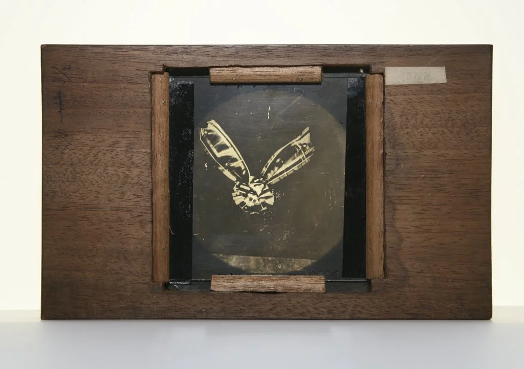
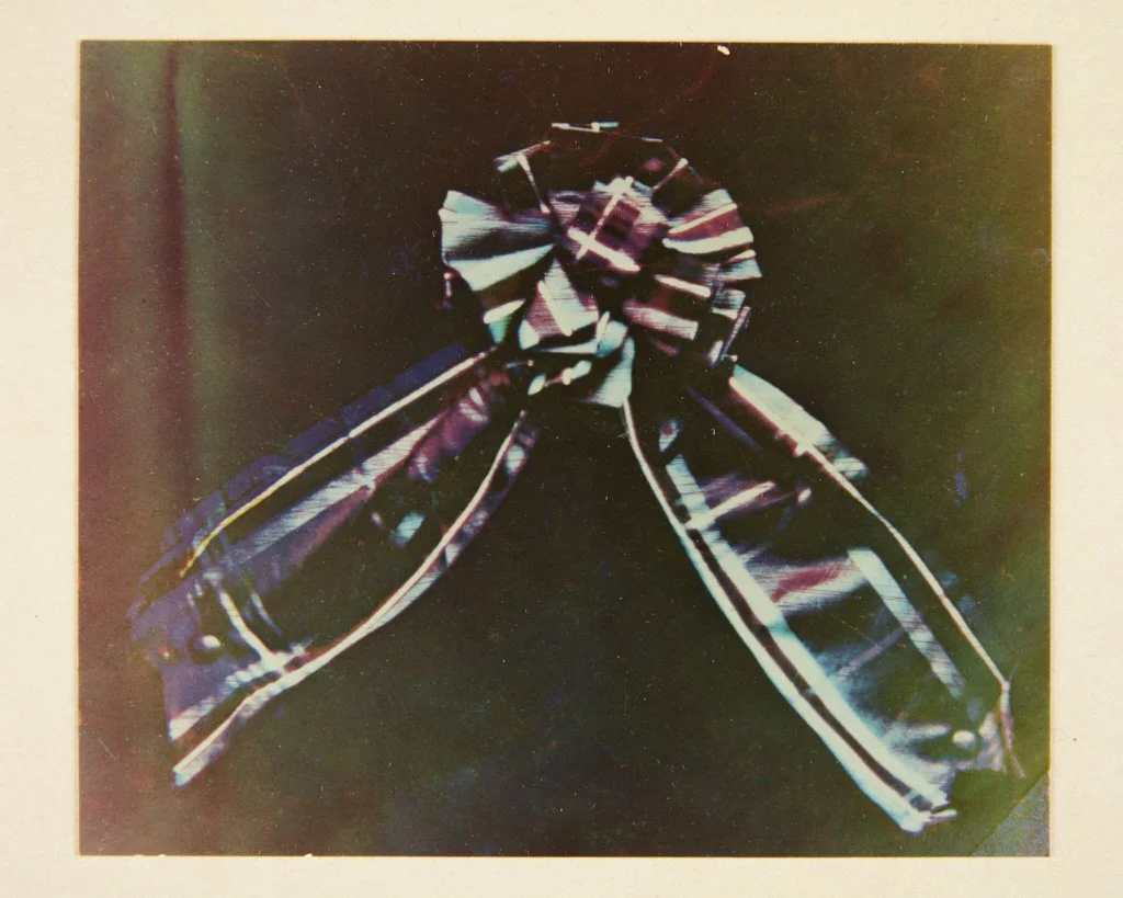
The three images that constitute the original three separations are still in existence and reside at the Cavendish Laboratory of the University of Cambridge, they are seen here -mounted and ready for projection, as anyone old enough to remember filling a slide carousel with transparencies the slides must be upside and backwards in order to be projected right way up out the lens and onto the projection surface, just as in your eye, another lens and poignant to mention here because, Maxwell’s colour theory has more to do with how the eye perceives colour than it does with photography itself – but are joined here through this singular experiment. These transparencies were created by the eminent and distinguished photographer Thomas Sutton, editor in chief of the publication Photographic Notes (1856-67) and inventor of the panoramic/wide angle lens and camera. Sutton was contracted by Maxwell to physically manifest his colour theory.  (Images 2, 3, 4)


There is no documentation regarding how this collaboration came about but one thing is clear – Maxwell was not a photographer and these were not his photographs. This is a common source of confusion.  On June 15th, a few months after the demonstration, Sutton published a very short explanation of how he created the transparencies used by Maxwell for his interested followers in the Photographic Notes“A bow made of ribbon, striped with various colours, was pinned upon a background of black velvet, and copied by photography by means of a portrait lens of full aperture, having various coloured fluids placed immediately in front of it and through which the light from the object had to pass before it reached the lens.  The experiments were made out-of-doors in good light, and the results were as follows:-….[iii]” So this is all we have from that evening in May 1861 – we do not have the ribbon, we do not have AN actual printed photograph, and we have no way of truly knowing what the re-aligned projected image looked like.


Here is the challenge with recreating this event: because we do not know exactly the quantity, quality or density of the coloured chemistry that Sutton employed in photographing the ribbon, and we also have no way of knowing the precise conditions for the lantern slide projections, we can never truly know what the projected image looked like during Maxwell’s 1861 lecture. Nor can we compare modern recreations to the 1861 ribbon for it is long lost– we will never really know empirically what was captured or what it looked like when it was projected. 


Thomas Sutton in fact said as much in his explanation of the experiment, “It is impossible to describe in words the exact shades of colour or intensity of these solutions”[iv] – the same can be said for the ribbon itself.  So even though we have the three slides, the actual “first ever photograph” does not AND - cannot exist. It was events that happened and now - like the Clash concert on January 1st 1977 at The Roxy in Covent Garden – only those present will ever know what it looked like.  


So what then did Thomas Sutton create sometime in the early summer of 1861? And was it a real tri-colour separation of that tartan ribbon?  The prevailing theory is that Sutton captured a sort of tri-colour separation using wet-collodion - a colour-blind photographic emulsion - and, accidentally, luckily captured the ultra-violet reflectance of the red portions of the ribbon on the red slide[v] (image 5)


 What were Sutton’s thoughts on the experiment? “…and when these different coloured images were superimposed upon the screen a sort of photograph of the striped ribbon was produced in the natural colours.”[vi] Not exactly a glowing statement of success!


What if instead of actually filtering differing wavelengths of colour Sutton merely created Neutral Density filters creating differences in exposure, not colour – such that that they could be separated into three distinct colour slides, and created a fake tri-colour image?


For me, as a wet-collodion practitioner of 12+ years, there are several details in Sutton’s limited notes that point to this possibility. After receiving digital images of the original glass slides from the Cavendish Laboratory, upon closer inspection, to my eye, I expect this is exactly what happened. 

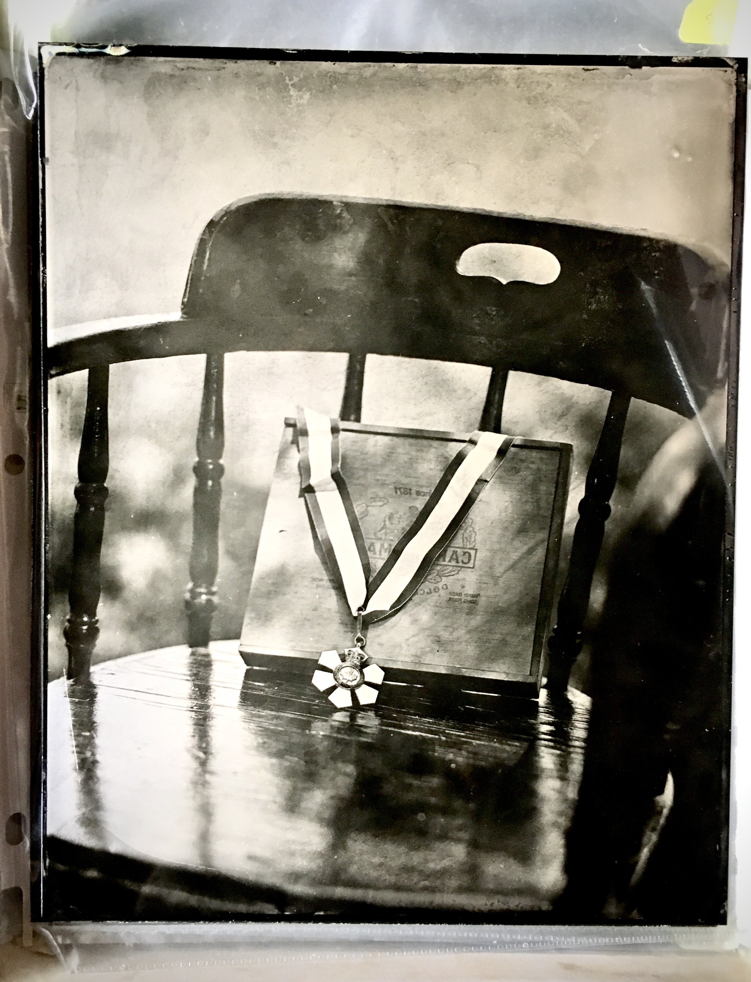
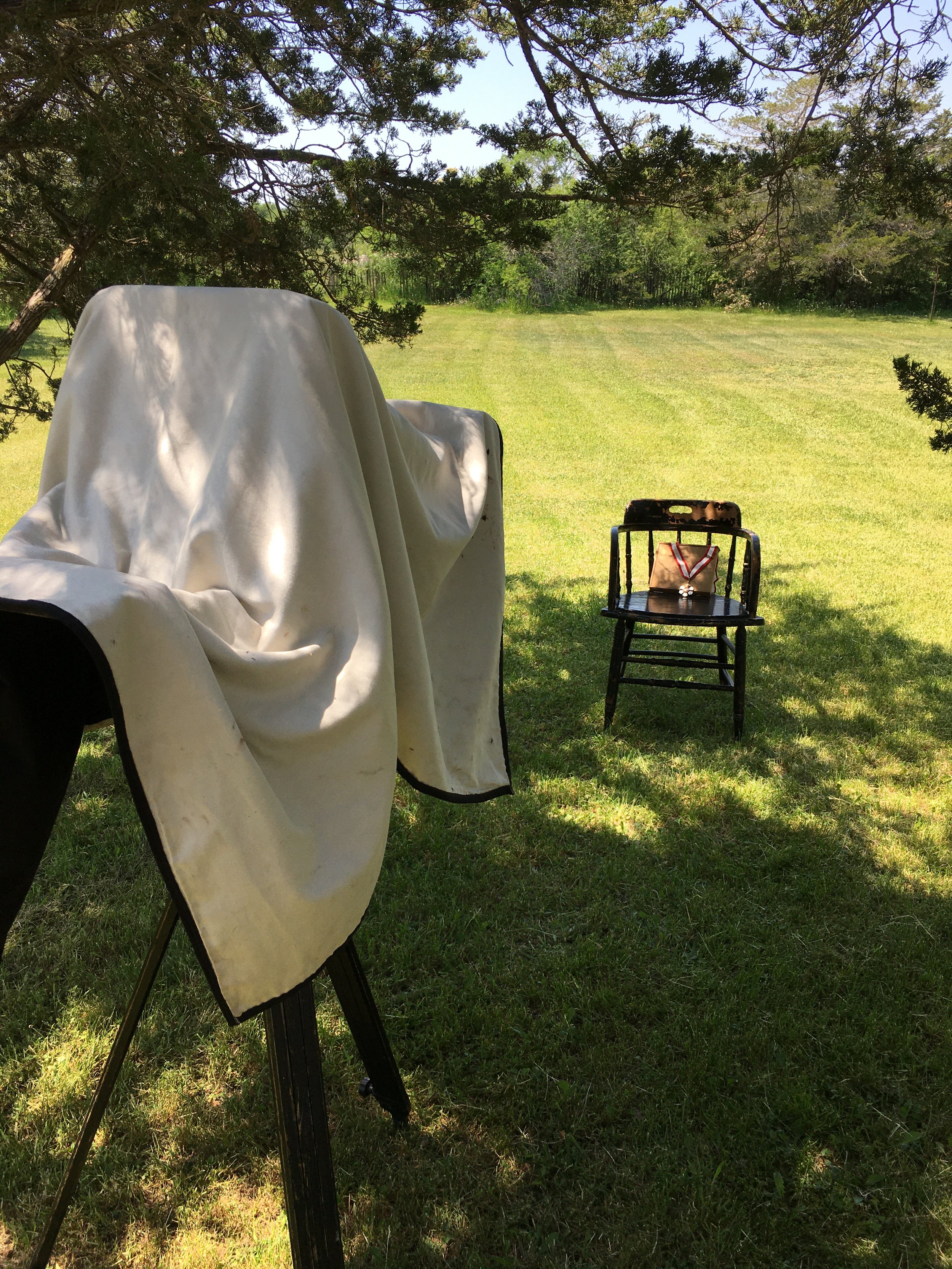
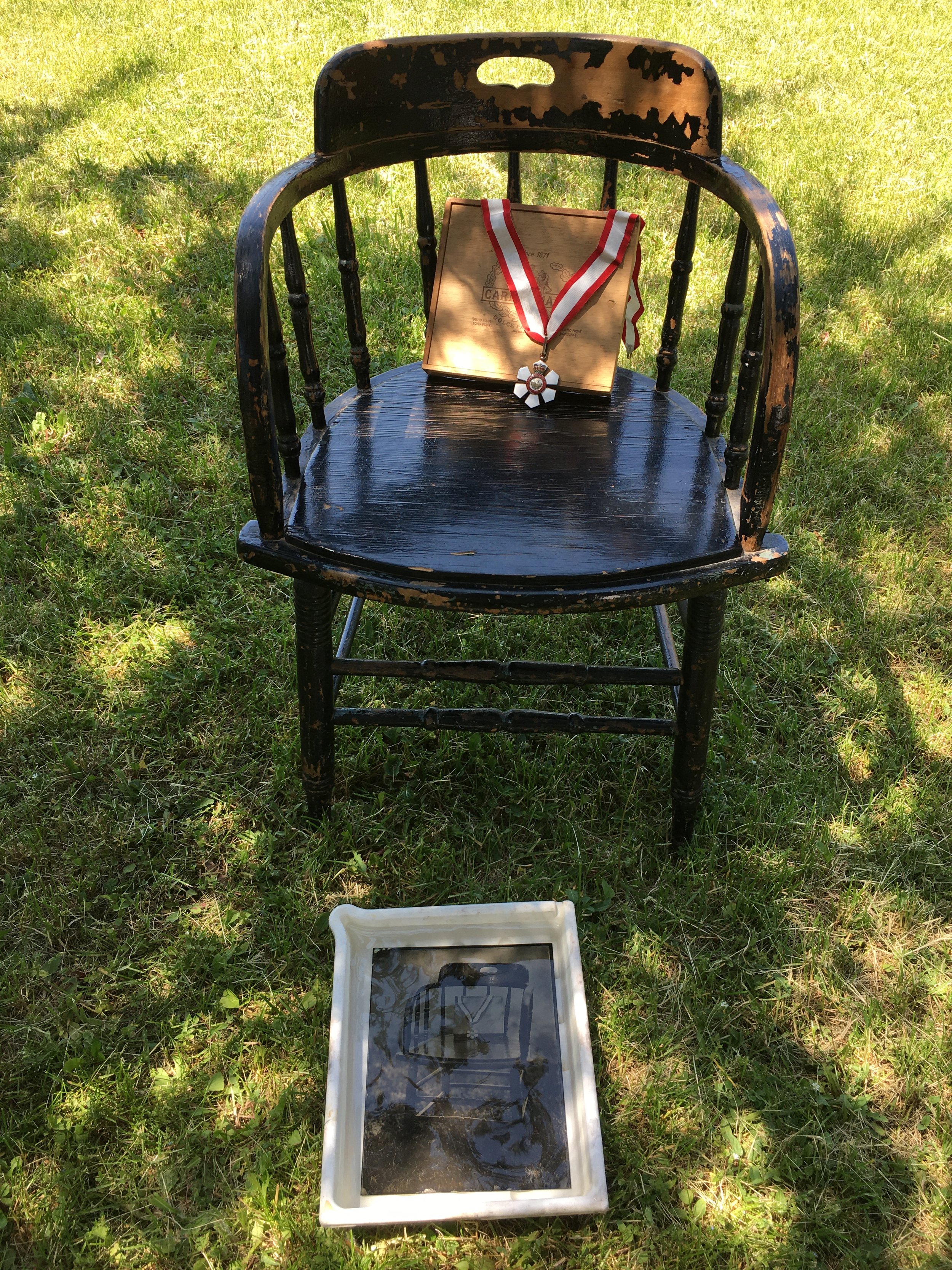
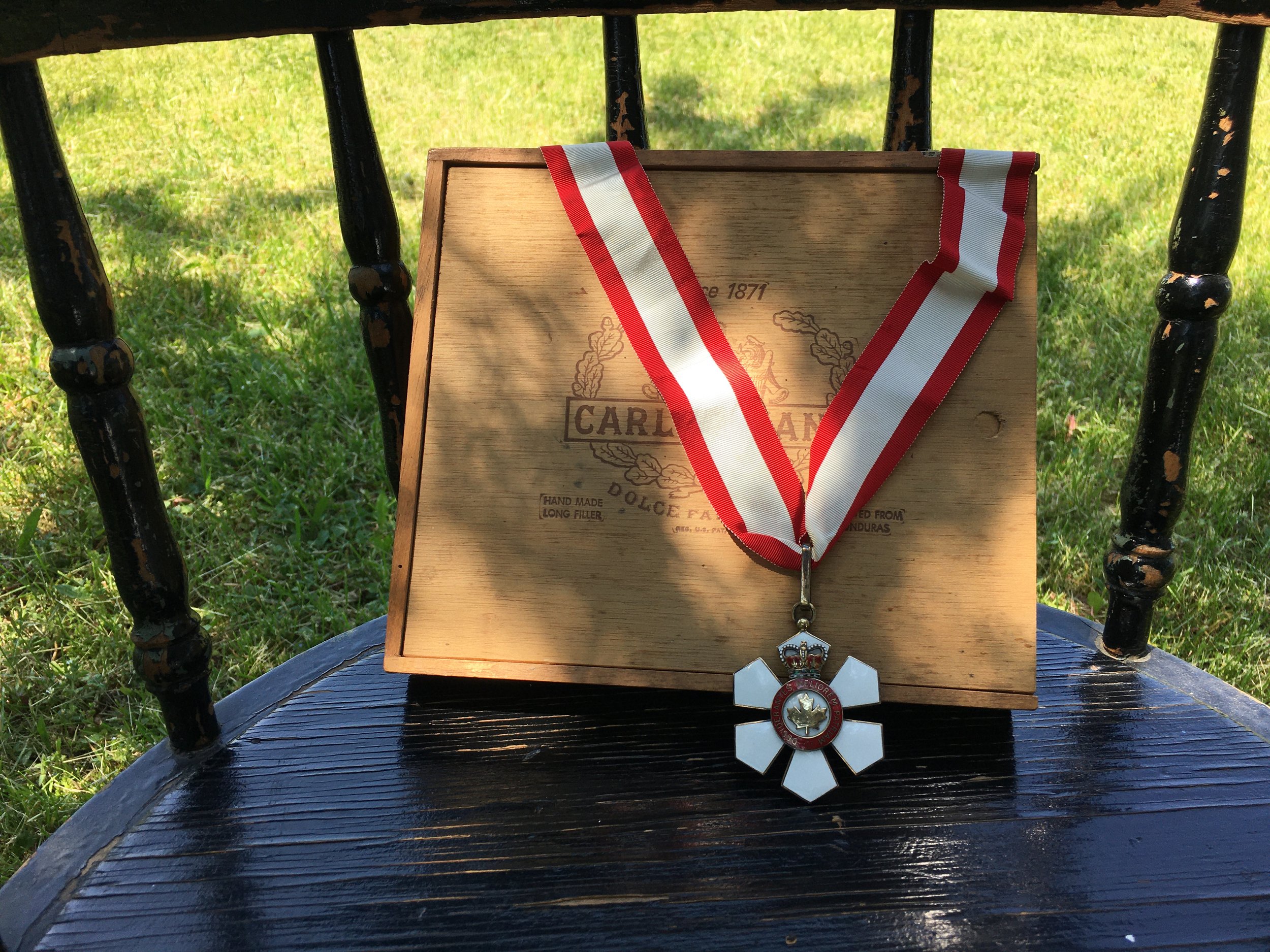
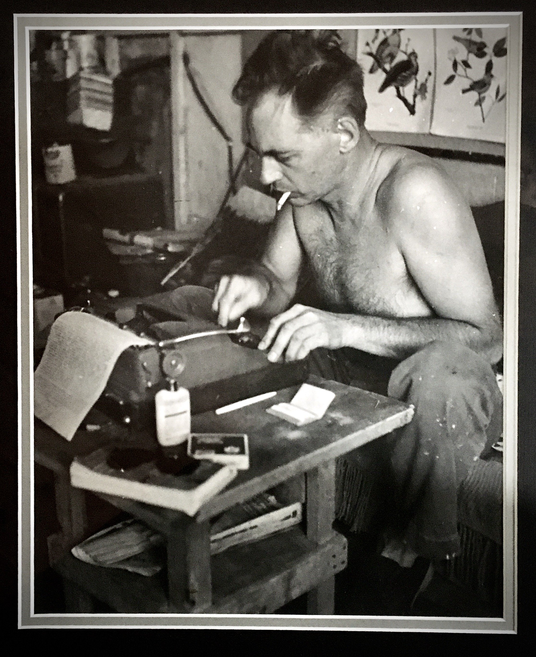
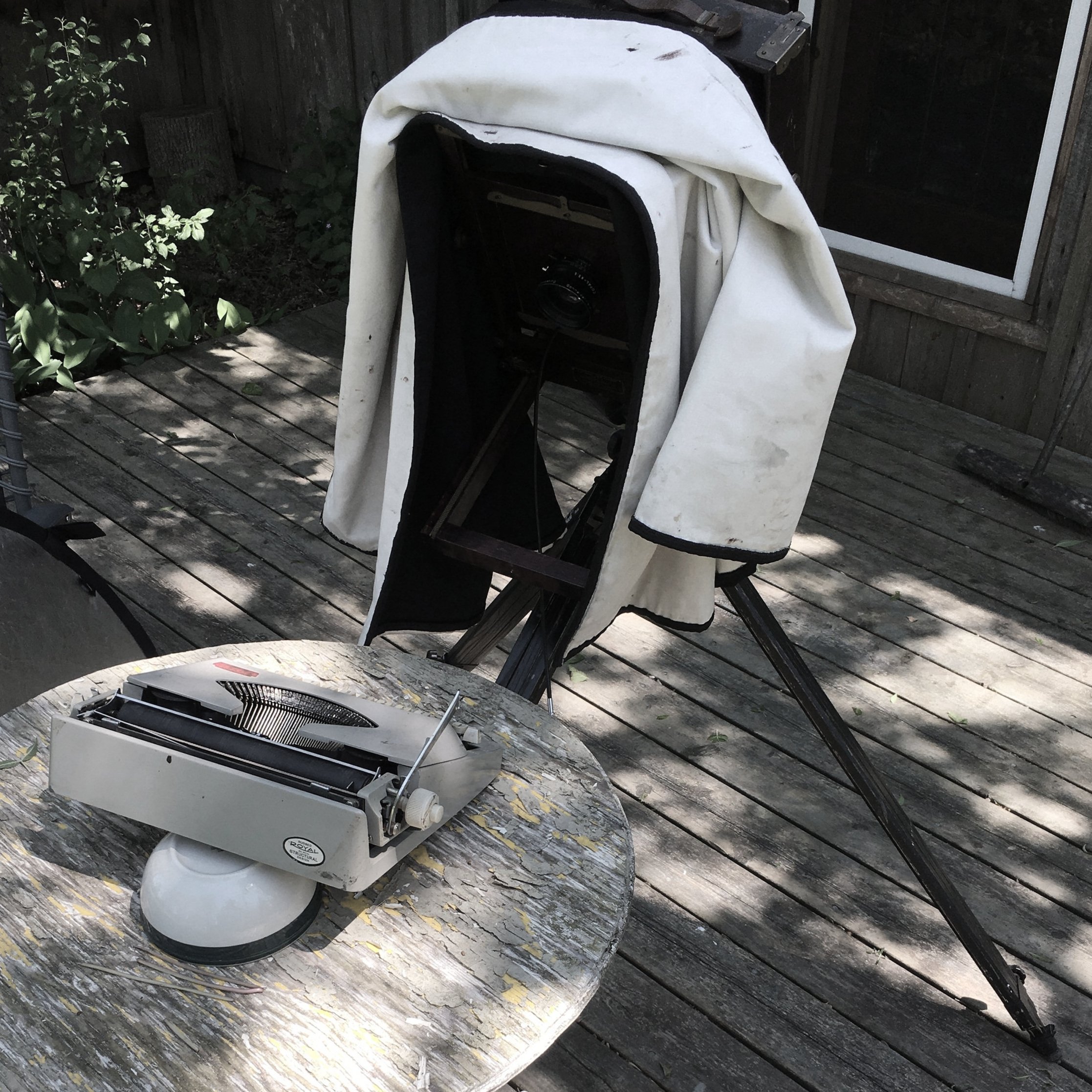
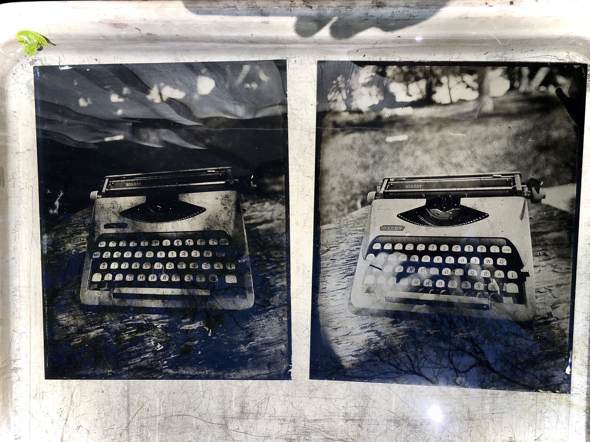
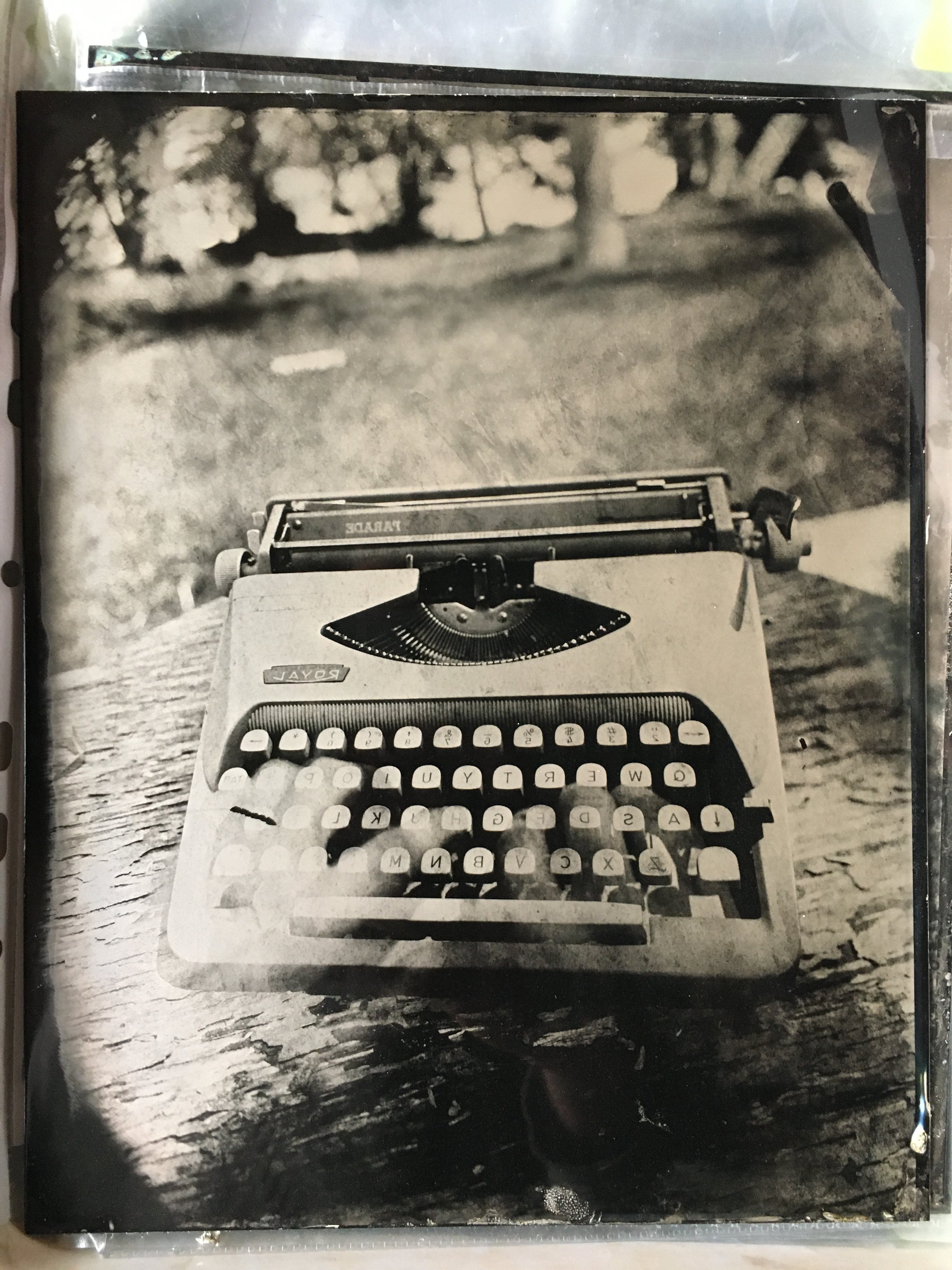
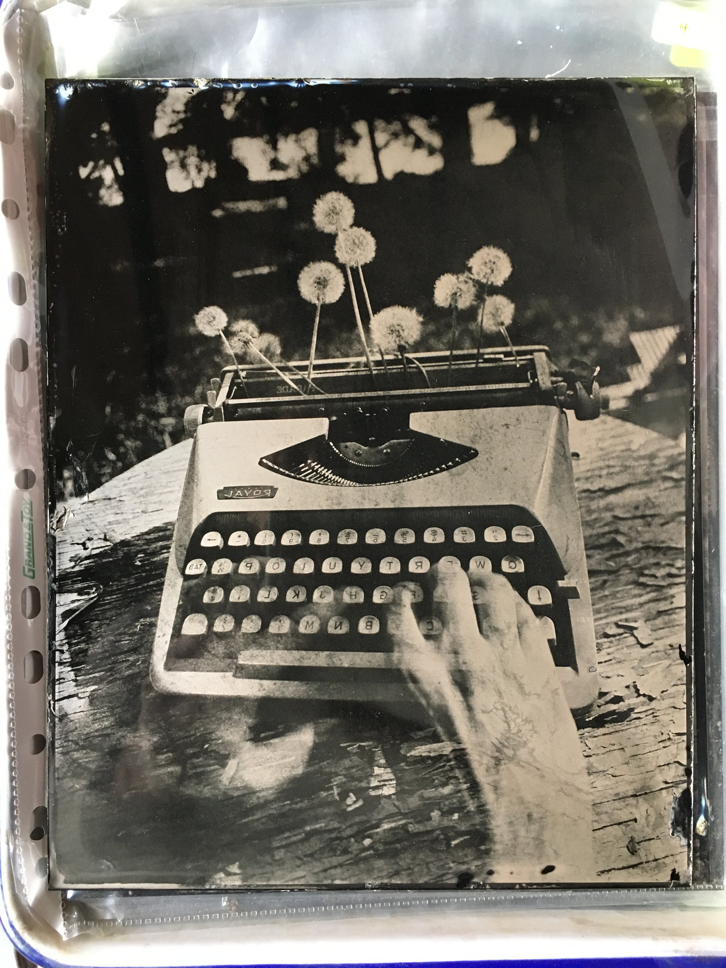
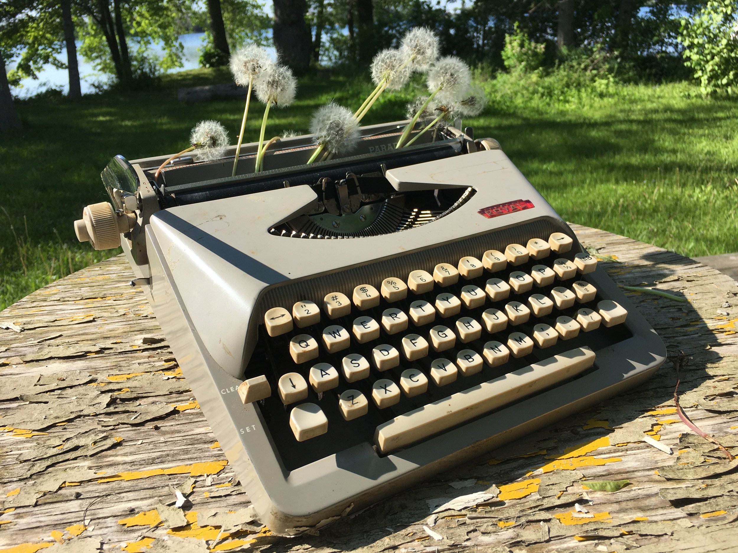
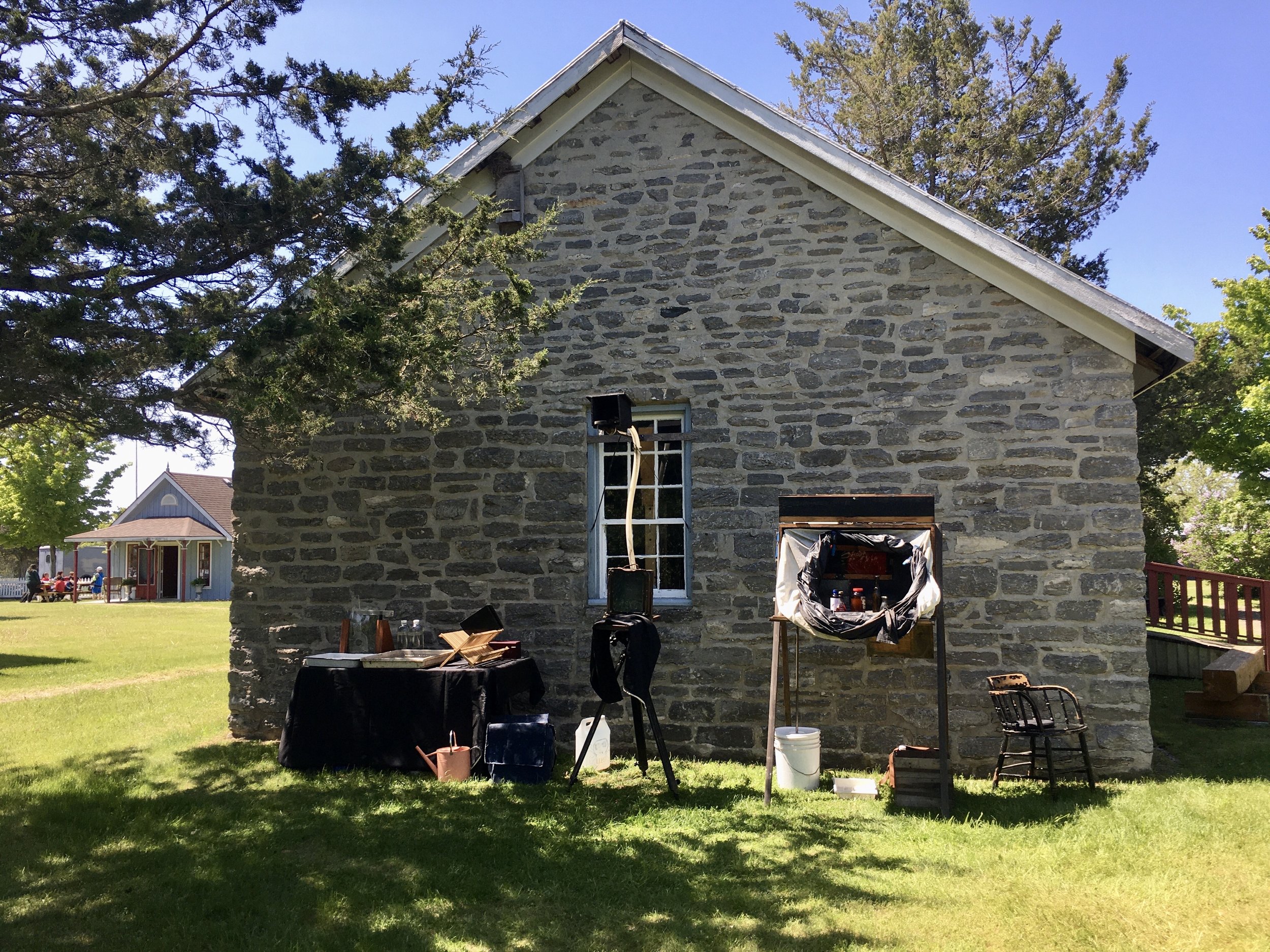
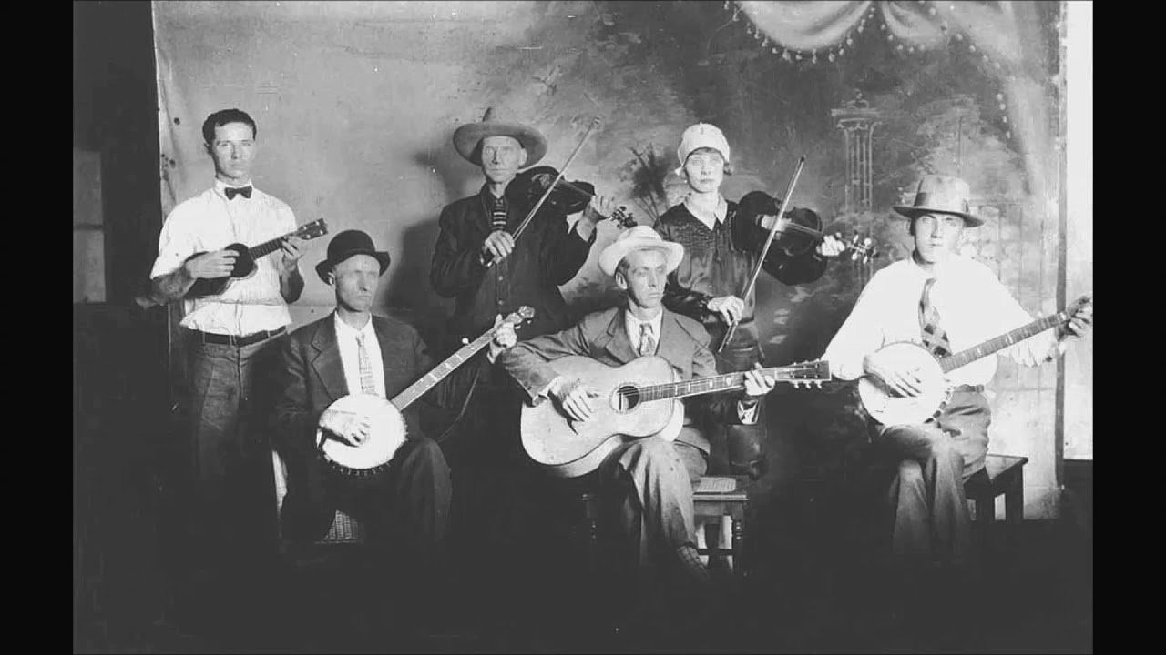
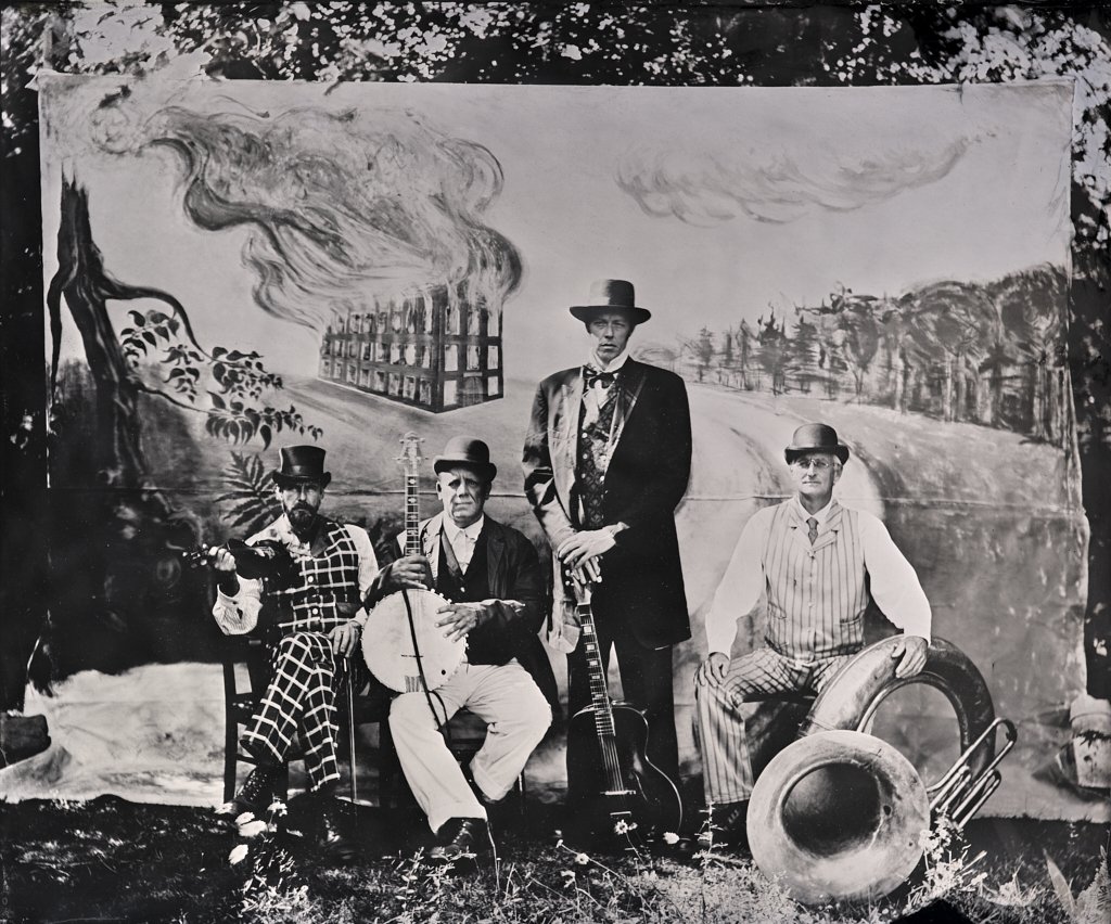
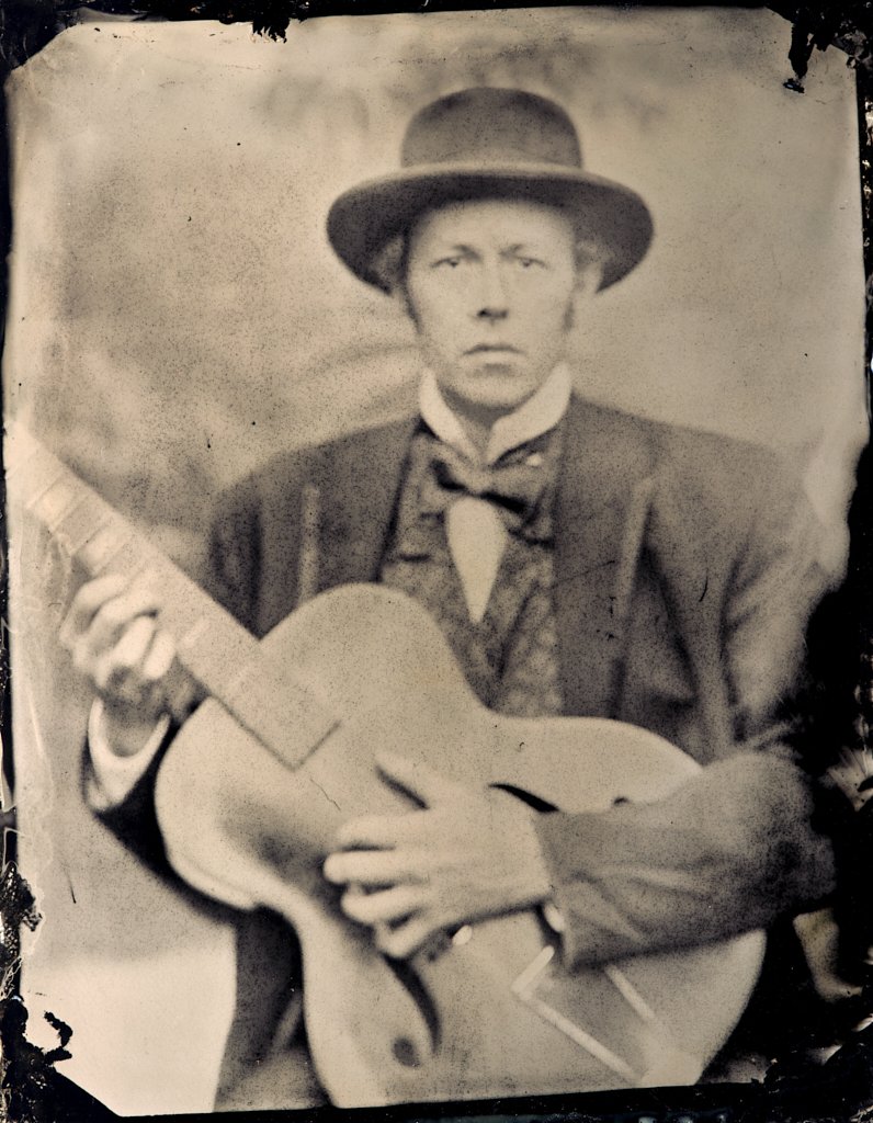
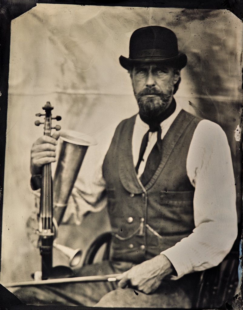
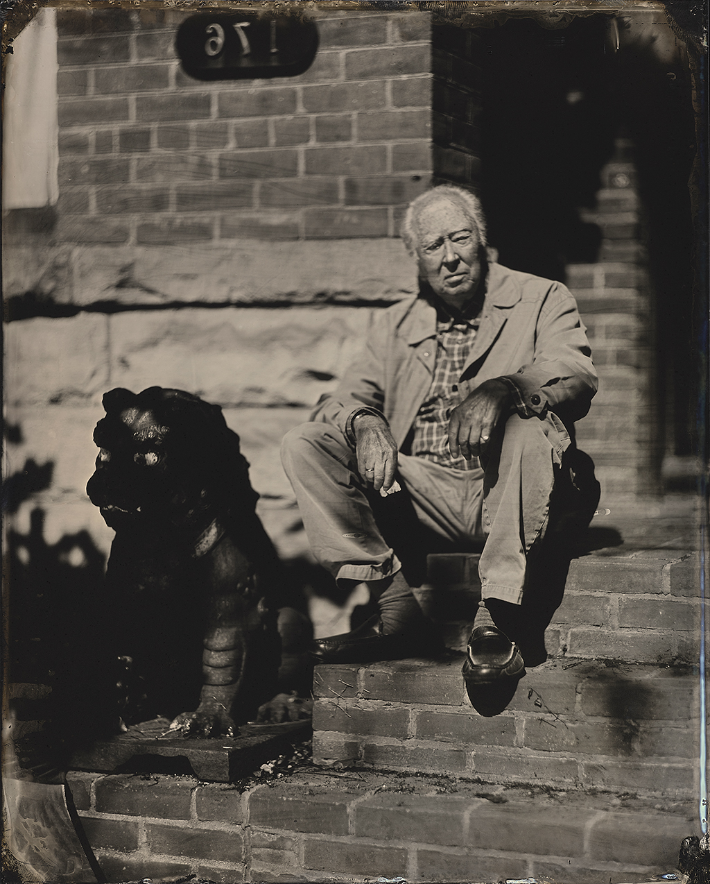
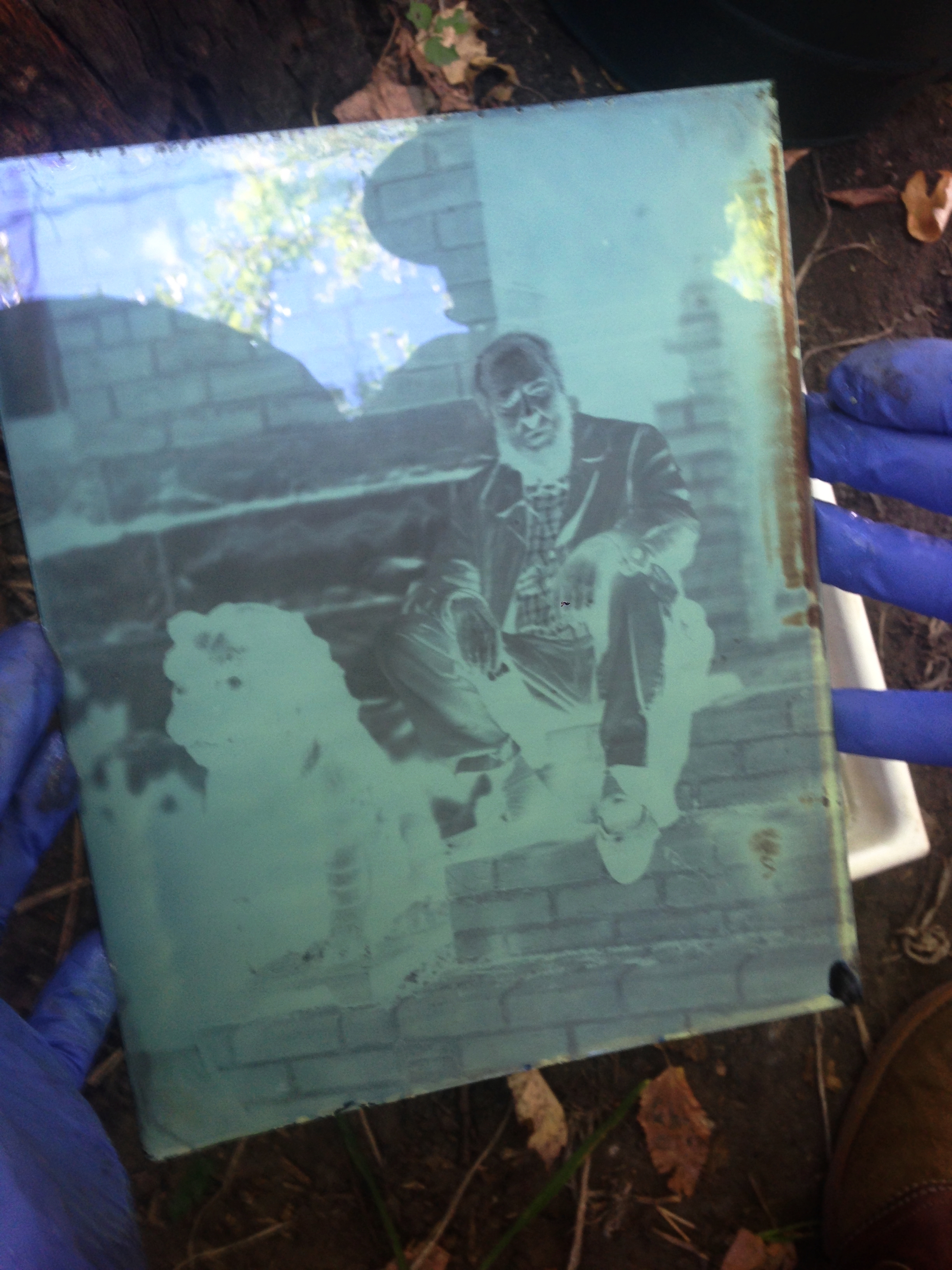
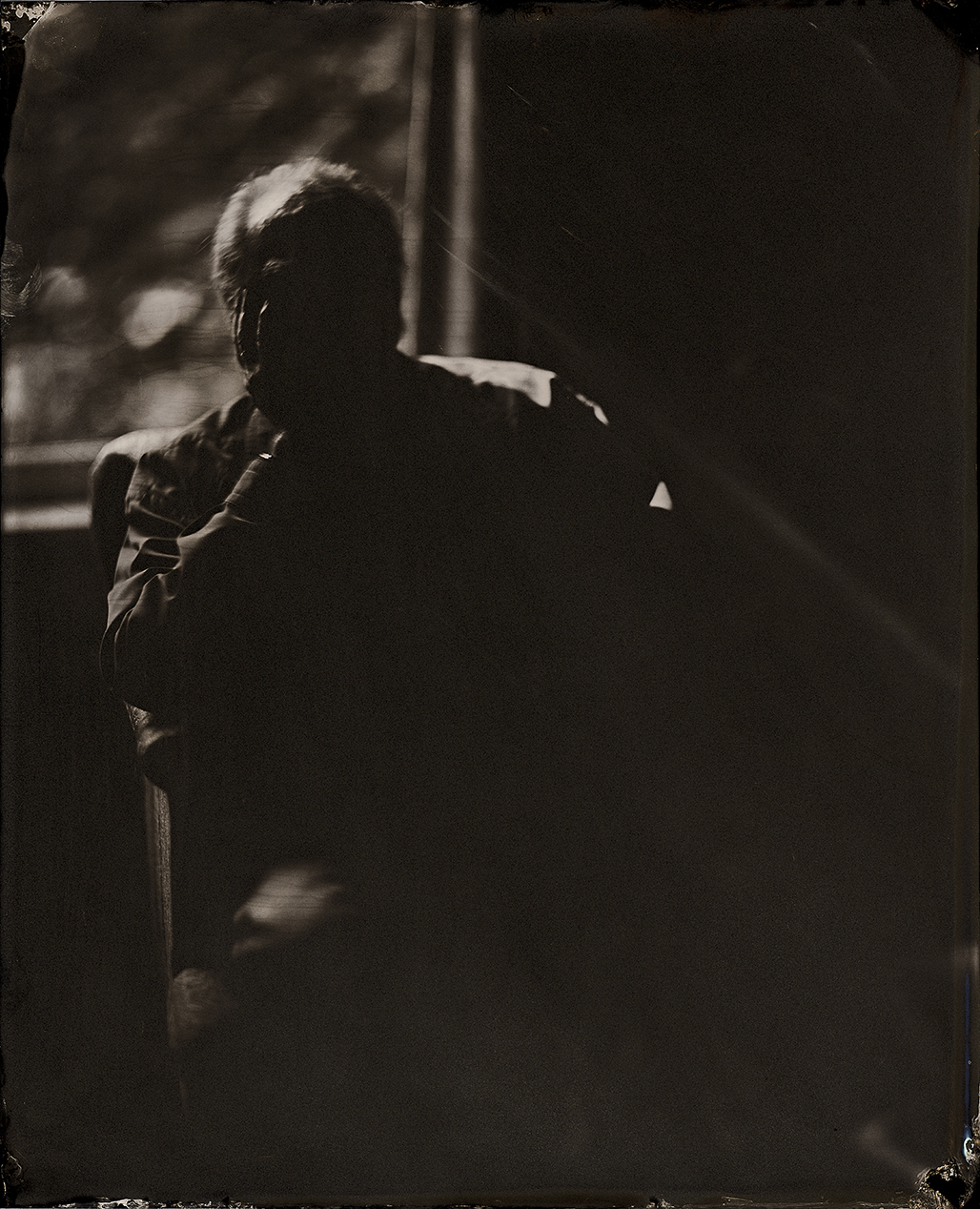
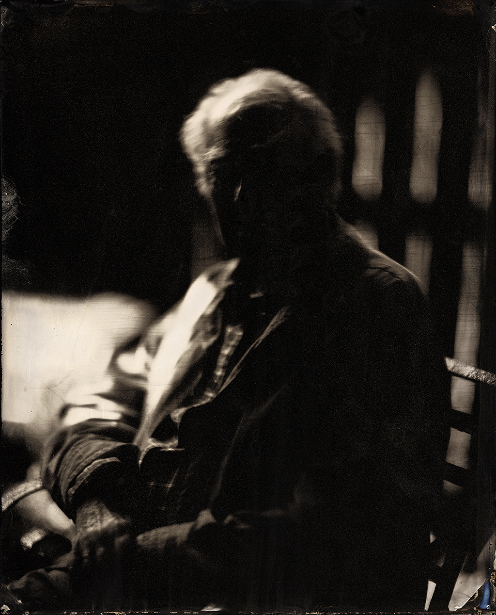
I set out to recreate the Sutton experiments using the original wet-collodion photography, first trying the colour separation and secondly using neutral density filters to test my hypotheses. To my knowledge this had never been tried before. I shared my thoughts on the whole matter with Dr. Susanne Klein from the CFPR and we decided on several key factors to clearly demonstrate: colour, printed colour, how wet-collodion sees colour, and measurements during exposure that would give points of reference and facilitate a more scientific approach and thereby creating a measurable/repeatable defined colour reference. (image 6)


Before we get into the nitty-gritty of these experiments it is worth taking a look back to the period when Fredrick Scott Archer’s invention of the Wet-Collodion process changed the course of photography. This quickly became the predominant process due to its “instantaneous” capabilities.  It was using this process that Sutton carried out Maxwell’s mathematical thought experiment.  


It is very important to note the specific limitations and biases of the wet-collodion process—they are key elements in explaining the actual results achieved by Sutton and what might have been seen by those present, when they were projected on that May evening in 1861.


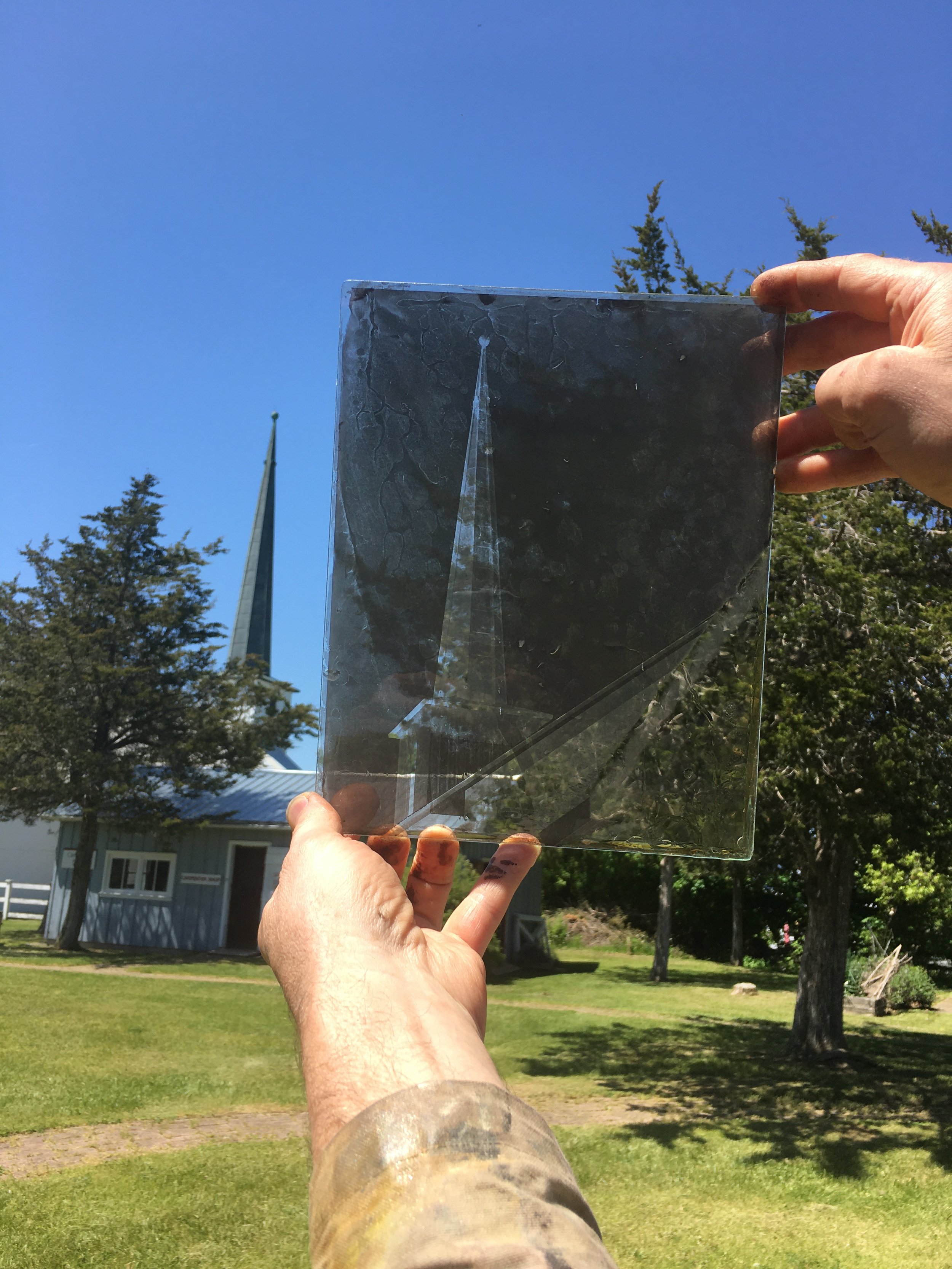
1.     First and most importantly, wet-collodion is a blue biased film emulsion. It cannot “see” past 500nm in the colour spectrum. In other words, the bromo-iodised colloidal silver emulsion has a limiting factor of only being able to capture/expose from about 300nm to 500nm of the full colour spectrum of light. (Image 6a)

2.     The process name itself describes the second limiting factor. After sensitizing in the silver nitrate solution, the clock starts ticking the moment a wet-collodion image is removed from the bath. It has about 15 minutes of ‘open’ time before it dries out and becomes exhausted and unusable. This time window can shrink dramatically depending on environmental conditions.

3.     This is an entirely hand-made process. From beginning to end—mixing the chemistry, hand-pouring the emulsion film across the substrate, managing the effects of the environment during lengthy exposures, the hand-poured development by eye, finishing out of the image, and finally fixation. The scientific exactitude of machine-applied emulsions, the constant regulated modern studio conditions and purity of chemistry were a dream not yet realised by photographers in 1861.


These three extremely important factors must be taken into consideration in reconstructing this demonstration.


The next part of the story of the “world’s first colour photograph” belongs to the image many of us have seen, loosely titled “The Tartan Ribbon.”

This actual physical object, which was once part of the Science Museum, South Kensington, London, now resides in the Victoria & Albert photographs collection - was NOT created by Thomas Sutton, but in fact is a Trichrome Carbo print created by Dr. D.A. Spencer in circa1937 using the VIVEX colour process and manufactured at the Colour Photographs (British & Foreign) Ltd. at a factory in Willesden, north London. Furthermore, is it possible that D.A. Spencer made this image as a way of promoting the his new colour process?[vii] (images 7,8)

How did this object come to be referenced as the object where all colour photography had its beginnings? I suggest this is an example of what has become known as the Illusory Truth Effect,[viii] which is the tendency to believe false information to be correct after repeated exposure.


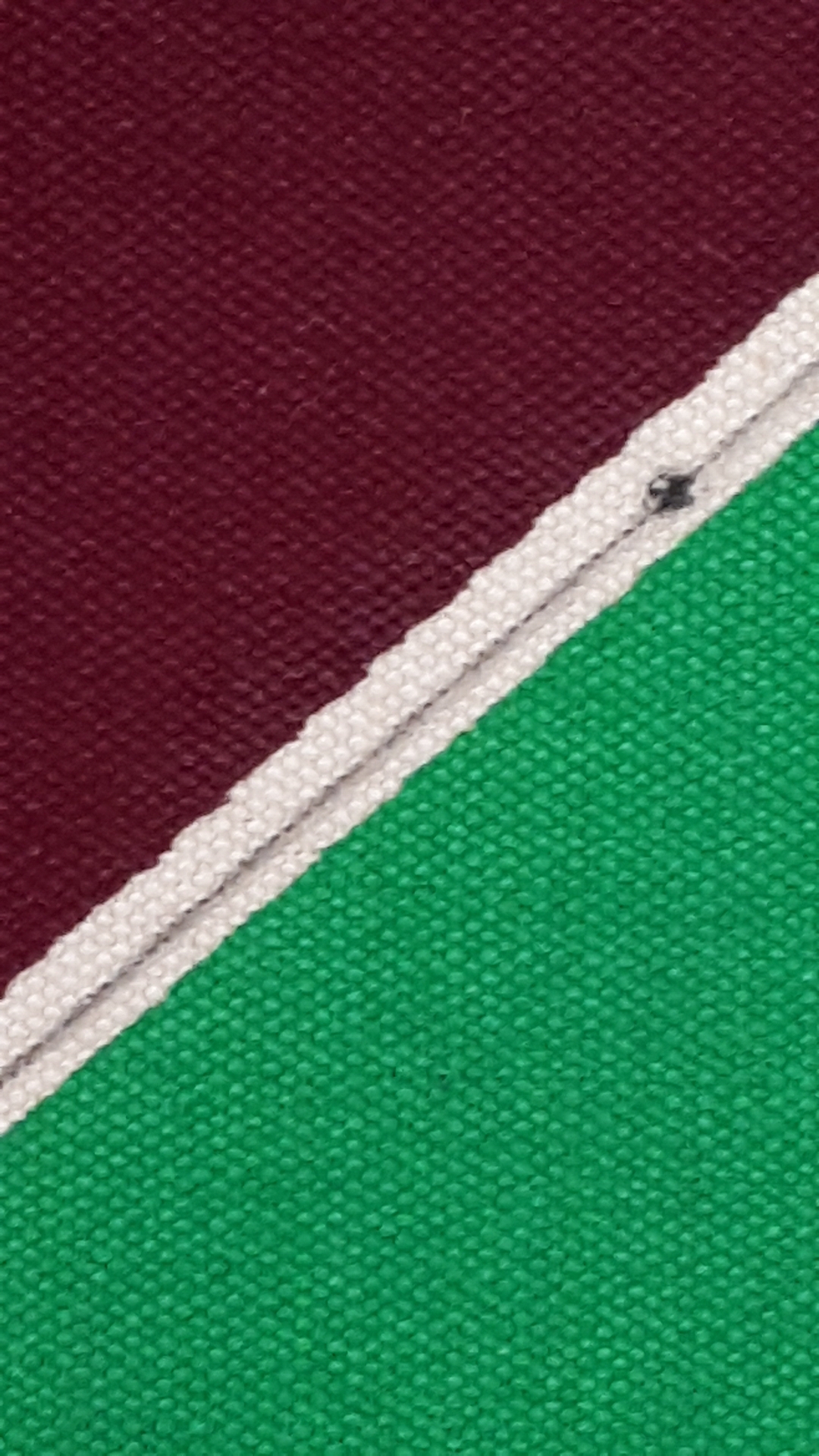
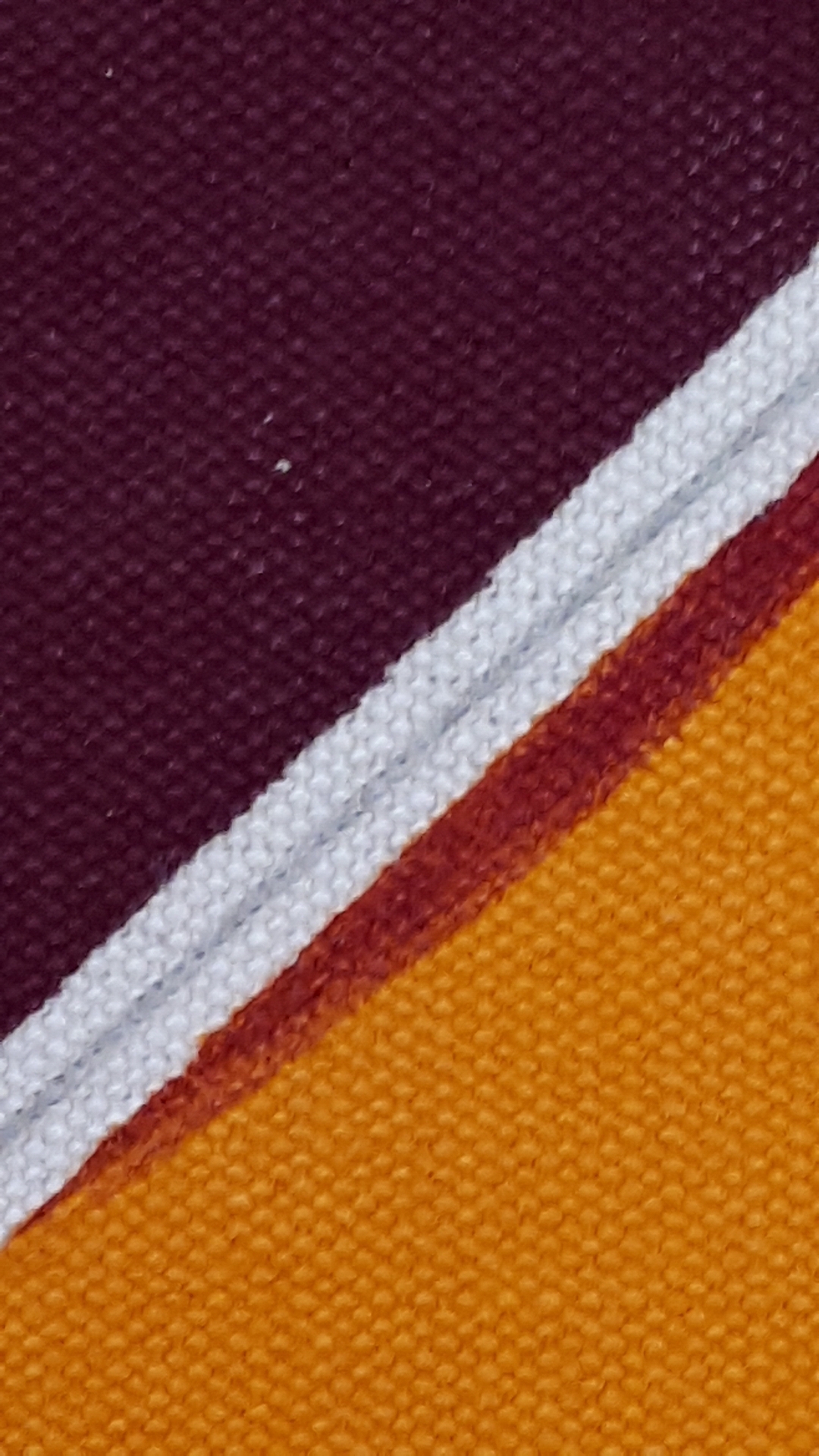
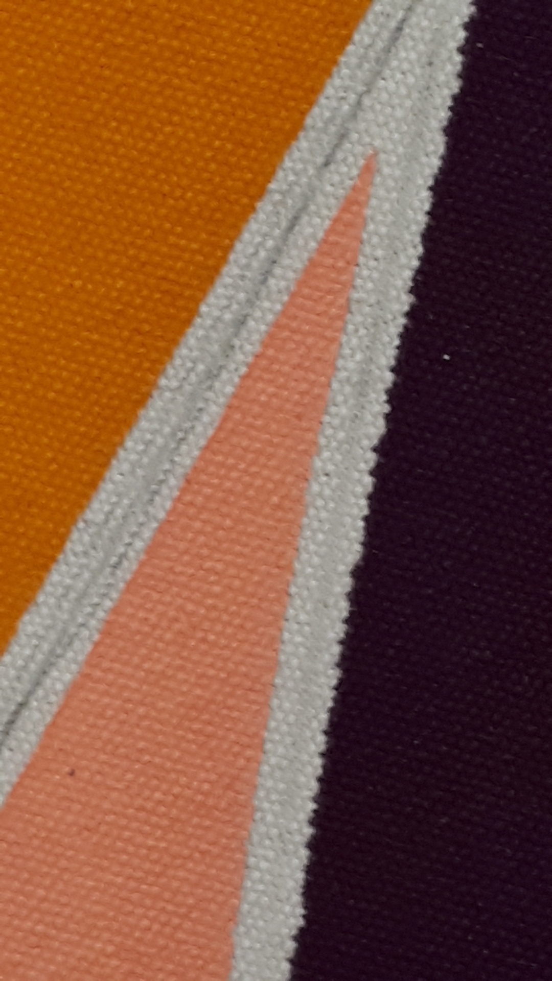
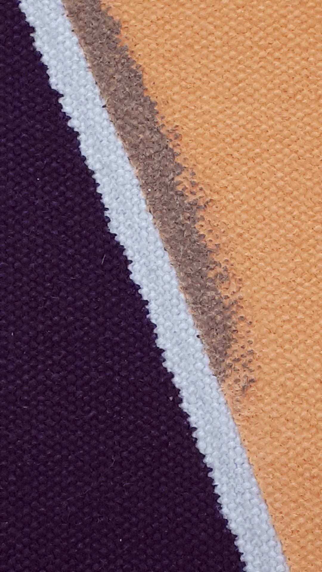
There is a particularly curious part of the VIVEX Tartan Ribbon image that upon closer inspection I discovered something rather odd.  At closer scrutiny, one can see repeated red scratch lines running on a diagonal through the entire coloured image. At first glance it might seem something akin to fabric texture, but on closer examination it is clear they do not correspond to what would be the weave, the warp or weft of the fabric but rather are just scratches. (See detail image 16)


I went looking for these lines/scratches in the red transparency, since they only showed in that colour on the final print. Nothing.  In fact I found them in the green plate. I found this very odd since green cancels red in the RGB additive colour system.  If this image were printed correctly those scratches should not be evident. My conclusion is that either by accident or on purpose this slide was switched and the resulting VIVEX image now exists, in this current state. (Image 17, 18)


[i] Ives, Frederic E. – The Perfected Photochromoscope and its Colour Photographs, Journal of the Society of Arts, London, April 24, 1896 pgs.517-525

[ii] Maxwell, James Clerk - On The Theory of Three Primary Colours, Royal Institution London, May 17, 1861. Reprinted in Photographic Notes, July 1st 1861 pgs.187-189

[iii] Sutton, Thomas – Photographic Notes, No.125-June 15, 1861 pgs.169-170

[iv] Sutton, Thomas – Photographic Notes, No.125-June 15, 1861 pg.169

[v] Evans, Ralph M. – Maxwell’s Color Photograph, Scientific American, Vol.205, No.5 November 1961, pg.120-128

[vi] Ibid #6

[vii] Evans, Ralph M. – Maxwell’s Color Photograph, Scientific American, Vol.205, No.5 November 1961, pg.120

[viii] Dryfuss, Emily – Want to Make a Lie Seem True? Say it Again. And Again. And Again, Wired. February 11, 2017.

Michael Snow's Lion

This past September 2017, I had the privilege of traveling to Toronto and take a portrait of the visionary Canadian artist Michael Snow.  When you get an opportunity like this a hundred ideas and many "what if's" go through your head, trying to prepare for all the possible scenarios so that you will be ready for whatever happens. Understandably, you only get one shot at a chance like this, but primarily when you respect someone, you want to capture there likeness in a way that has something representative of their stature....yes of course that is what I wanted - transcendence, photographic wetplate transcendence.

It's OK, you can laugh - I know it is a tall order.

We arrived early morning loaded with all my wetplate gear knocked on Michaels door and after some simple chit chat, he directed us to his backyard, where I was to set-up and do the portrait. Heather, my partner & assistant went to check it out and I went back to the car to get the gear.  As I was filling my arms Heather returns and says, "Ummm, have you seen the backyard?"   Suggesting perhaps, if Michael had sent me a picture, during our email conversations.  I say, "No why?"....Ok, I am getting nervous.

It is your typical Toronto postage stamp backyard, not unusual and kind of what I was expecting - the real problem though - maple tree saplings had grown up to a level and density to block out most of the light, but more importantly the blue light, critical to wetplate, I swallowed hard. There was however a shaft of light passing between the two adjacent buildings that for about twenty minutes might offer some illumination - but I hadn't set up yet!

This was sort of the flavour of how the whole day went - basically chasing the light and a very patient Michael Snow around his house, to somehow just miss the image and light I was looking for in my minds eye.  It is only when looking back over the images many weeks later that allowed me the space and time to see what was captured.  The fourth image below is the only result from that backyard shaft of light glory moment, for by the time I had got set-up and poured the plate, posed & and composed the portrait, my ray of light was gone and Michael was getting cold.  The image I captured at a 45 second exposure is more of an expression of the moment then the tack sharp mirror representation we expect from formal portraiture.

I did manage to get that sharp image though, on his front step along side the fu-dog with demonic eyes. The sun was shinning straight on and into his eyes so it gives him a badass grimace, not at all the kind, accommodating, and patient man I had the pleasure of passing a day with. As for the images, - not quite the image(s) I had in my mind, but as always - far more interesting than anything I had imagined.

Alizarin.02 - The Adventures of Prince Achmed

The Adventures of Prince Achmed - 1926

Charlotte "Lotte" Reiniger - (2 June 1899 – 19 June 1981)

35mm - First Feature length Animated Film

Several years ago I had the privilege of viewing a projection in glorious 35mm, a restored copy of The Adventures of Prince Achmed originally released in 1926 during the end of the silent film era.  This film does not, in my humble opinion, get enough praise.  The first full length feature animated film, Created, edited and executed by a woman, in a time when this was exceedingly rare, not because of ability - which is obvious, but again because of patriarchal control of the industry.  Reiniger along with Behold Bartosch devised and used the pedecessor to the first multiplane camera which, preceded Walt Disney and Ub Iwerks by a decade.  A back-lit contraption utilizing several layers of glass and on each plane different characters or objects each animated or still, giving the illusion of depth on a flat plane. This is a remarkable film even 90+yrs later the way the colours illuminate the entire theatre and the simplicity of a story told through shadow puppets is mesmerizing, but to watch it on the big screen flickering through the majestic BAUER U2 is a life changing experience.  Honestly, put this film on your bucket list - you will not be disappointed.  I have added below a few added bits of information I "curated" from the internet. Enjoy!

Oh, and btw all the images but the last one were photographed in the theatre trying to capture and describe the luminosity and brilliance of the projected experience, hopefully you get the idea.

( The Adventures of Prince Achmed a story based on elements taken from the One Thousand and One Nights, specifically "The Story of Prince Ahmed and the Fairy Paribanou" features a silhouette animation technique Reiniger had invented which involved manipulated cutouts made from cardboard and thin sheets of lead under a camera. The technique she used for the camera is similar to Wayang shadow puppets, though hers were animated frame by frame, not manipulated in live action. The original prints featured colour tinting.  No original German nitrate prints of the film are known to still exist. While the original film featured color tinting, prints available just prior to the restoration had all been in black and white. Working from surviving nitrate prints, German and British archivists restored the film during 1998 and 1999 including reinstating the original tinted image by using the Desmet method. Noël Desmet, starting in the 1960s, developed his own flashing method for restoring silent films, which had originally been coloured either by the process of tinting or toning (or both). With Desmet’s method, the original colour print is first copied onto modern, panchromatic black and white inter-negative film, rather than colour film. The colours are then applied later during production of the positive print.)

Several famous avant-garde animators worked on this film with Lotte Reiniger, among them Walter RuttmannBerthold Bartosch, and Carl Koch.

In 1923, she was approached by Louis Hagen, who had bought a large quantity of raw film stock as an investment to fight the spiralling inflation of the period, who asked her to do a feature-length animated film.  There was some difficulty that came with doing this, however. Reiniger is quoted as saying "We had to think twice. This was a never heard of thing. Animated films were supposed to make people roar with laughter, and nobody had dared to entertain an audience with them for more than ten minutes. Everybody to whom we talked in the industry about the proposition was horrified."


Alizarin.01

FIRUZABAD (Variation) 1970

Acrylic on Canvas

Frank STELLA   b. 1936

This is the first in a series of blog posts that examines singular works of art - up close, through my own particular non-linear singular obsessions, in visual art - about process, creation, ideas, art history and detailed, sometimes macro photography. Welcome, and enjoy.

Firuzabad is a work from the Protractor series of paintings, 71 super punchy highly technical geometric designs both in execution of the imagery and the shapes of the canvasses themselves.

In 1967 during Stella's time at Emma Lake,  Artist's Workshop, in Saskatchewan Canada, (an artists think tank of sorts that saw the likes of Barnett Newman, John Cage, Clement Greenberg pass through its doors.) is where this body of work was initiated. Yup, looove the Canadian connection!

All the works in the Protractor series are based on ancient cities in the middle east that Stella visited. He translated the ancient city plans and geographic layouts to the canvasses themselves. I'll explain.

FIRUZABAD is an ancient city in southwestern Iran its circular plan was designed and built between the 3rd & 7th C.  that included 3 ringed walls. Now, take a look at the satellite image of Firuzabad and compare how Stella riffs on this simple layout to create both a modern masterpiece and an homage to the design and architectural masterpiece of the ancient Sassanian culture. 

While carressing the paint surface with my eyes I was intrigued by the dafting marks Stella left behind. I loved the macro compositions I could create from the intersection of paint and pencil.

Ok, so are you still with me?  Researching Firuzabad and Sassanian Empire architecture I learned a new word. Squinch. 

Squinch is a structural solution to the problem of "how do you build a dome ontop of a cube...without the dome collapsing?"

A Squinch of course!

- (incidentally it is believed that this support was invented by the Sassanian culture at Firuzabad)

(I have included images as well - Thx to Wiki CC) 

Soooo, now you see, what I saw in Stella's Firuzabad painting were the drafting squinches that literally held and created the work!


Outdoor Readymade

...some images or spaces make themselves...

Great things of 2014 - Something in the Way. @Les Territoires Montreal, QC.

This past Summer I had the good fortune of stumbling into Les Territories in the Belgo building in Montreal, QC. on a sweltering hot day in august.  A set of workshops led by the Berlin-based sculptor Miriam Jonas. With title Something In The Way, the 2014 Creation workshops set out to examine the notion of limits as an enduring concern in contemporary sculptural practice. The resulting objects both interactive and playful riffed on this theme - the viewer became collaborator as they engaged with the objects pushing them around the space.  Simple in design and execution, this exhibition demonstrated brilliantly all that I love about sculpture, space and the thinking artist.

Participating artists:
Charles-Antoine Blais Métivier - David Martineau Lachance - Jean-Sébastien Massicotte-Rousseau - Lauren Klenow - Miriam Jonas

Great Things of 2014 - Anna Torma

This particular exhibition entitled Bagatelles  @ the Karsh-Masson Gallery in Ottawa, Ontario in August was a highlight to me in 2014.  Anna Torma of in Baie Verte, NB is a TEXTILE ARTIST that produces large-scale hand embroidered wall hangings and collages.  The scale and intensity of the work itself, of these beautiful multilayered marathons of embroidery really knocked me off my feet.  So much so, it was hard to put into words and has taken me a long time to get it here.   What I truly enjoyed seeing in this exhibition was that the back of the embroidery, as it was fully displayed, was just as interesting as the front. Moving between the different folds of silk as they hung like massive flags of her children's creative growth depicted in the beasts and monsters fire-breathing and stomping over-top of each other. Many at 210x280cm each, my fingers get cramps just thinking about the all that thread, delicately drawn with needle and thread. I would catch myself tracing the stitches back and forth comparing patterns or just losing myself in the texture and rhythm.  I am a sucker for a good monster anyway, but the joy of these works was impossible not to internalize.   Walking away from this exhibit I found myself light on my feet and with a silly grin on my face.  There are many things referenced in Bagatelles beyond monsters, from Fibonacci to imagined and historical plants, all these images fell into each other with a careless ease.  To read more about Anna Torma's work click below and do not miss it if she is showing in your area.

EN MASSE @ Station 16 Montreal - SPRING 2014

Remembering this spring En Masse's amazing installation at Station 16 - 3523 St-Laurent boul. in Montreal, featuring paintings & prints made in the round.  A fantastic show and if you missed it, only the prints and paintings (if your lucky) still exist.  Here are a few of the highlights and my personal favorites.  The circular paintings are exceptional and detailed to perfection.

Excuse me, did you say something...?

Sad, hilarious and delicious all at the same time.