Part Two: Recreating the Experiment & the Results
It is probably best to begin with the details of the experiment that we do know based on how Sutton described them in No. 125 of the Photographic Notes, June 15th, 1861.
1st. A plate-glass bath, containing the ammoniacal sulphate of copper which chemists use for the bottles in their windows, was placed immediately in front of the lens. With an exposure of six seconds a perfect negative was obtained. This exposure was about double that required when the coloured solution was removed.
2nd. A similar bath was used, containing a green solution of chloride of copper. With an exposure of twelve minutes not the slightest trace of a negative was obtained, although the image was clearly visible on the ground glass. It was therefore found advisable to dilute the solution considerably and by doing this, and making the green tinge of the water very much paler, a tolerable negative was obtained in twelve minutes.
3rd. A sheet of lemon-coloured glass was next placed in front of the lens, and a good negative was obtained with an exposure of two minutes. [This glass plate has been lost.]
4th. A plate-glass bath, similar to the others and containing a strong solution of sulphocyanide of iron was next used and a good negative was obtained with an exposure of eight minutes.
…The thickness of fluid through which the light had to pass was about three quarters of an inch…the negatives…were printed by the Tannin process upon glass and exhibited as transparencies… (Image 9)
When I first read this, the statement of 12 minutes of exposure for the green filter immediately raised doubts. As stated earlier, fifteen minutes is pretty much the longest exposure one could achieve in the heat of a spring day out of doors. Taking into consideration all the handling prior and after exposure, if the plate had not completely dried out, a good portion of it would have begun to dry inward from the edges but yet, the plate exists? Again, as you read, the difference in exposure times between that of the blue plate at six seconds and every other exposure is measured in minutes, with the extreme example of green, an exposure of 120 times that of blue.
It wasn’t until I was able to take a magnified look at the original transparencies from the Cavendish Laboratories, that numerous wet-collodion details became very apparent, including the oddest detail pertaining to the VIVEX Tartan Ribbon photograph.
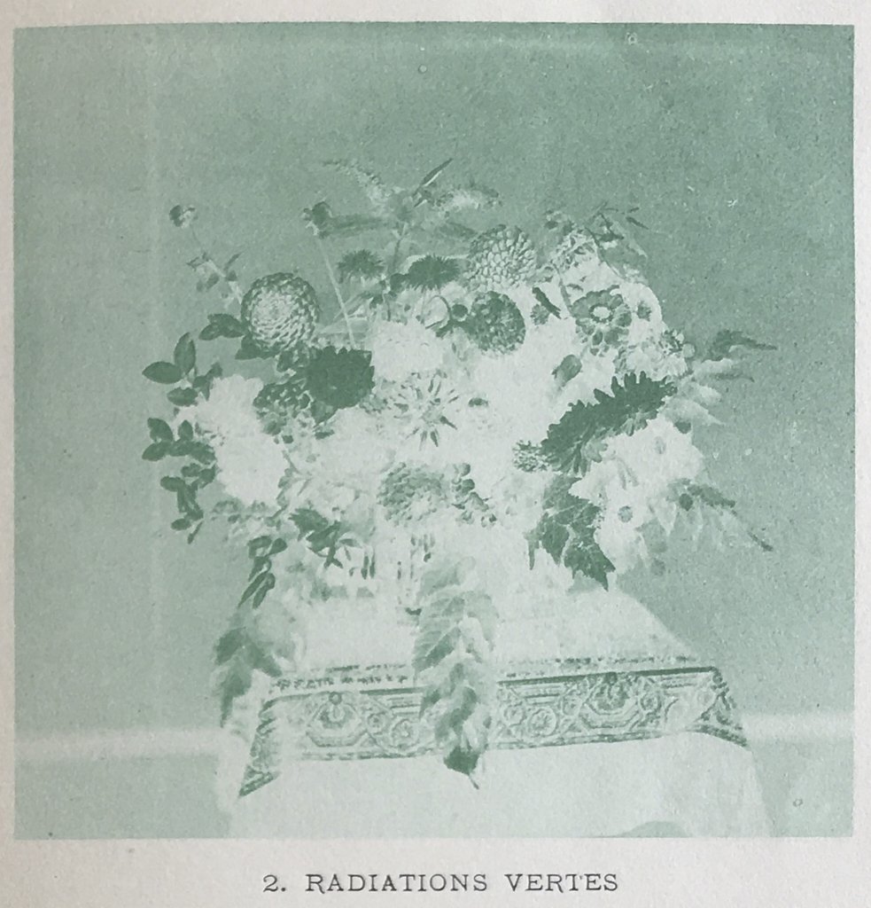
We can take an example of a true tri-colour separation of the period for reference. I use the Leon Vidal flower arrangement circa 1877 to demonstrate that when comparing the red, blue, and green channels, portions of the image completely disappear. I understand that this is by no means fair comparison due to the advances of technologies, but it does illustrate what should, to some degree, be happening in the Sutton ribbon images. (Images 10, 11, 12)
If we do the same with Sutton’s transparencies this is barely noticeable, but what we can clearly see is that they become darker or lighter globally as opposed to specifically. In fact, in the blue transparency there are highlights from the change in sunlight creating noticeable increased exposure or “hotspots” (not because of colour filtration) which are still noticeable in the red slide although considerably lighter. If Sutton had managed to isolate colour these would not be apparent.
We can almost definitively say that the repeated “overexposed” lines of the ribbon, which are repeated in each of the transparencies, are either blue or white because this is exactly how a very saturated ultramarine type blue or white presents itself. “Haloing” is very common and consistent with wet-collodion. (Images 13, 14, 15)
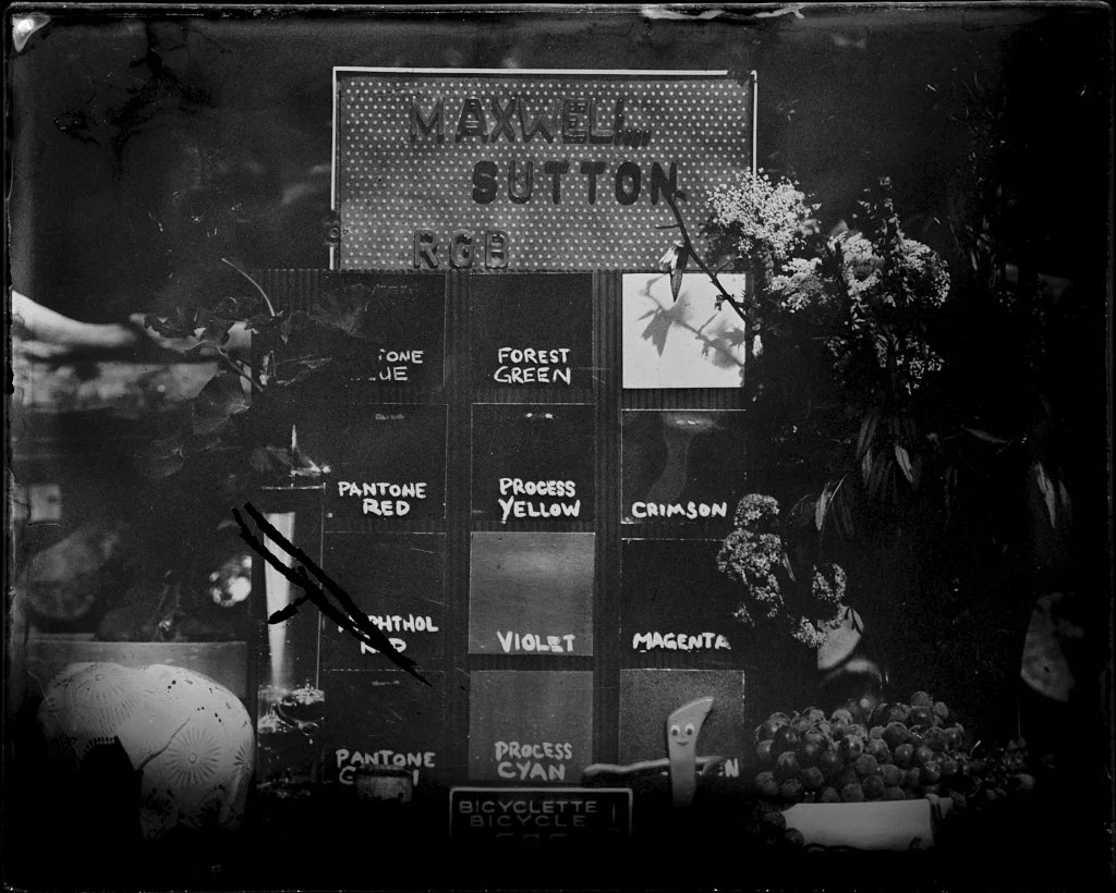
So on to our experiment. We decided that it would be crucial to create a colour space that is known and repeatable. Therefore we choose several currently available printers inks and then began to carefully measure their chromatic response. This step is crucially important to a clear scientific understanding of how or if, they fluoresce, how much or little UV reflectance they might have, and where on the visible light spectrum they lie.
By using printer’s inks we could achieve dense vibrant colours that use high quality pigment in high concentrations to give clear and factual signal response, clearly demonstrable in the resulting wet-collodion image. The resulting images were startling and might give some idea of what the image Maxwell project might have actually looked like.
Another very important detail to remember is that projected light is very different from reflected light – that is, light passes through the plate and can dilute and disperse what we see as the emitted result whereas, in a print, what we see is the light reflecting off of the print and we perceive it directly. Compound the diluted transmitted light with the understanding that lanternslide technology of the time was very crude and would have used condensers and reflectors to concentrate candle light, these multiple factors could have contributed to lacklustre results.
Now to the experiment results:
During three exceedingly hot days in August 14th to 16th 2021 I conducted two experiments using wet-collodion photography utilizing two separated Kodak Wrattan filter packs. The first would be a standard tri-colour pack Red, Blue, Green which then modified and substituted greatly diminished filters of red and green just as Sutton himself had, after realising the initial densities of his red and green would not function in capturing an image. (Image 19) Which became Blue No.47B, Green CCG0.20 and Red CCR0.20. Then on day three - Kodak Wrattan Neutral Density Filters ND0.10, ND0.60, ND1.60 all of course adjusted for required correct exposure. (Image 19a)
If we take a close look at the first colour separation results - knowing what the actual and precise colours were in our still-life arrangement we can see that very little actual colour separation was achieved - BUT great differences of exposure and density were! Creating an illusion of colour separation. Is this at all different from the Sutton Slides? I would argue not that much. As I had stated earlier consider the very saturated ultramarine type blue or white as it presents itself. “Haloing” is very common and consistent with wet-collodion and is something presenting clearly in the white lettering on each swatch and specifically the ultramarine colour square - it being the key reference. (Images 20, 21, 22)
After which, I scanned the images and digitally applied colour in various ways; amount, density, hue, chroma and tone - both as a negative and then reversed and a positive print. The resulting examples are a fascinating study in how one might create a sort of tri-colour image, in numerous and varied ways. Although, none of them - if we actually know what the quantity and defined colours are are indeed correct - except perhaps and correctly - blue. (Images 23 to 26) If we had had no colour reference (as in the Sutton slides) we could celebrate the creation of a full colour image.
Have I created a Colour photograph? You might say yes - a version of one it is true – but only if we DIDN’T know what the actual colour of the objects looked like – but not so much if we know. Recall the ultramarine blue…? Also looking at the top two images (Images 23 & 24) we can recall Suttons words – “a sort of photograph of the striped ribbon was produced in the natural colours.”
And what of the images captured with neutral density filters? The results where extreme in their density and exposures and would benefit from contact printing (future experiment) and as expected they vary greatly but little as in the way of true colour separation. It is harder to perceive the differences because they are subtle but still apparent. These plates are presented as positives, just as Sutton did with the ribbon and what is not visible or easy to present digitally is the density of the plates and how they vary greatly, which - if printed mechanically would present a much longer and dramatic tonal range. Again let us pay attention to the white and ultramarine blue, notice how they halo and the other coloured squares only shift slightly. As would be expected the most dramatic plate is in the image with 10 mins of direct exposure, notice also, the drying in from the edges. (Images 27, 28, 29) If we apply colour as before to the separate plates we get a sort of coloured image. (Images 30) So after much and varied experimentation I would propose; this particular faux colour wet-collodion image or one of my previous examples, is more likely what the audience on that evening in May 17th 1861 would have seen and what Maxwell would have projected, thanks to the great expertise of Thomas Sutton. My final thoughts harken back as I invent the evenings ending moments and what Maxwell and Sutton’s conversation might have been, as the cigar smoke was settling, the few remaining tweed covered gentleman fondling their drinks near by as the two where packing up their slide projectors, Thomas and James after some quick witty banter quietly eye one another agreeing in unison, “ lets not speak of this again, agreed? Agreed” - and so for more then three decades so it stayed. It was not until others found it self-serving to align themselves with the great James Clerk Maxwell, even if – by his own words, the experiment was a failure. The theory most definitely was not and I guess this is what we should remember and work together to correct the spin in current photographic history circles from “The First Colour Photograph” to “ The First Attempt at Tri-Colour Separation.” (Image 30a)